
Reinventing the Swim Lane Diagram. Part 2.
Please click on any image to view an enlarged copy
This article is a continuation of the “Reinventing the Swim Lane Diagram” process. Part 1 concentrated on ways to increase the efficacy of the swim lane diagram. Methods such as using color in a sparse and efficient manner, clearly defining each color’s meaning, and the induction of labels and annotation led us to realize to a more profound exchange of information.
Before we start Part 2, let me take pause to respond to some of the feedback from Part 1.
With any diagram, standard or best practice, it is vital to ensure that whatever you use, it’s appropriate for your audience. The typical audience for my swim lane diagrams is business users. At Websense, we are lucky to have an architectural and design group to handle the technical interpretation of business requirements. My group concentrates on understanding how a process is performed today, and then working with business users to decide how it is going to work in the future, providing insight into the complexity of the process. For the business stakeholder, the system they use of the utmost importance as it is a major contributor to their success. For example, performing a process in the slick CRM system might be a very different proposition to the clunky Quote System. We use the template for both “as is” and “to be” process documentation; and we generally communicate it through an analysis review or in the context of the final requirements document, although the diagram has its own standalone value.
In addition, my goal in Part 1 was to create a mock diagram, from which you could conjure ideas for a variety uses and applications, each tailored to individual demands.
In Part 2, I’ll explore some further additions to the swim lane diagram, which will help place a process in the context of a wider business picture. I’ll also cover how to increase and maximize the use of the swim lane by creating a Visio stencil. I’ve decided to add a Part 3, where I’ll cover an effective way of demonstrating the underlying data in a simple format, which builds the swim lane further.
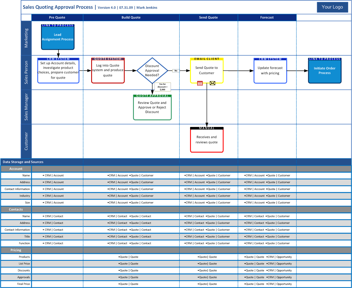
The finished diagram from Part 1 is used again in this article.
Scott had mentioned in his comment about Part 1 that it is important to show the inputs and outputs of a process, and I agree. I achieve this by adding “process link” boxes, again with an appropriate color and label.
In the example below, I added the start feed as well as the output. For the detail-oriented, I also updated the version number and date.
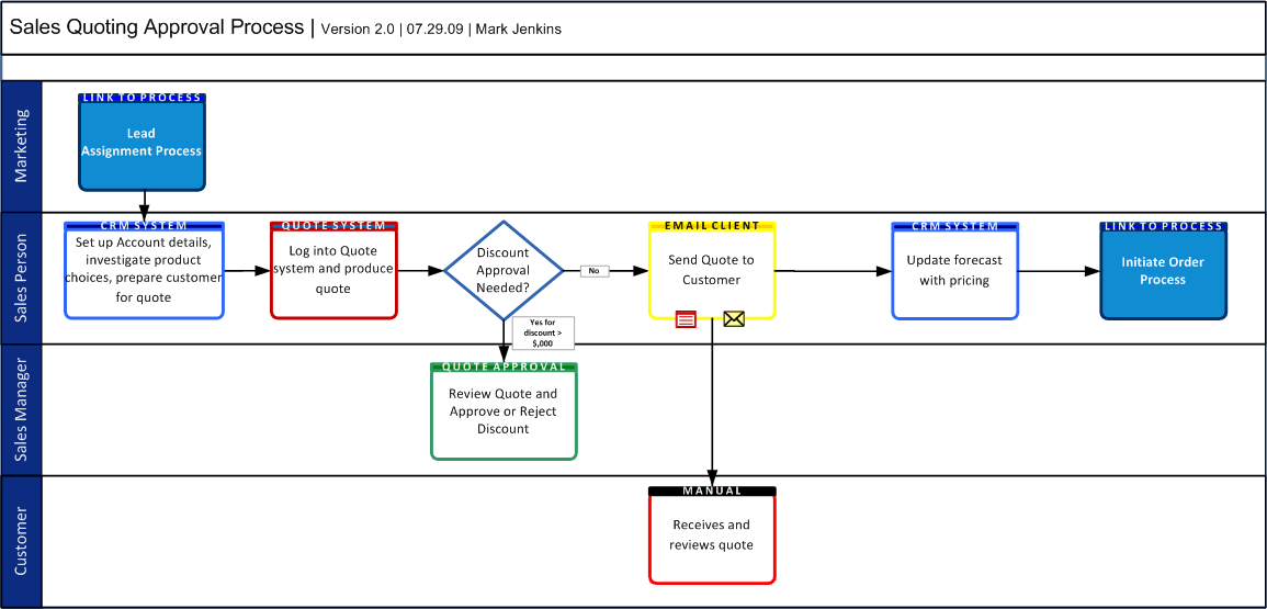
This diagram now easily shows a Marketing start process as well as an output order process, initiated by the sales person. You could also consider annotating the bottom corners of the process boxes with numbers, but I think it’s unnecessary unless you had multiple start points or confusing decision trees.
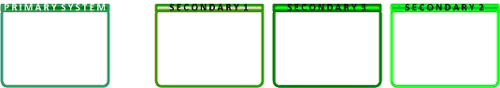
In order to increase and maximize the use of the swim lane diagram, I’ve found it effective to develop a Visio stencil. Creating a Visio stencil for this purpose can “template” or “palate” shapes for use in future designs, therefore drastically reducing the time it takes to create swim lane diagrams.
Make sure you have the majority (if not all) of your systems identified beforehand, this will help you when choosing color groups. If you are using a Visio stencil in group environment (i.e. a team of BA’s) then proactively meet and set up the stencil together. This should prevent divergence when you later come across a new or overlooked system. Using primary colors to designate certain system groups is also effective. For instance, you can use different shades of your primary color to indicate systems which “hang off” of a main system, as shown in the example below.
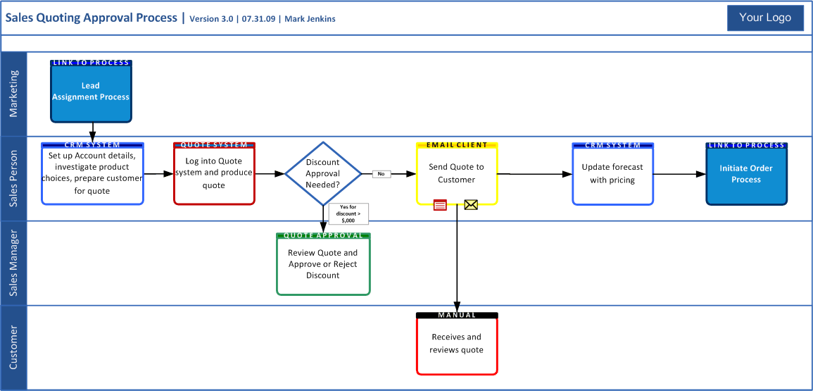
If your group has a team logo and/or a company logo, add this to the swim lane frame (which we also created as a stencil shape).
Another nice touch is to use the company color scheme on the frame borders and swim lane headers.
These two small points allow you to produce something that looks official, which adds major percentage points to the credibility of the diagram. You can end up with final version of the diagram that looks something like this.
The great advantage of the Visio stencil is that it provides a framework on which you can build tailored stories that clarify process meaning and purpose. The first step, for my group, was to consistently use, adapt and improve the stencil. At this stage, you are basically road testing, ensuring that you have included everything you need. As the diagram is used in documentation or meetings, you are generating awareness and hopefully interest in the diagram. The business users’ benefits of seeing a consistent diagram format are also significant, reducing the comprehension time of changing diagram formats.
Once you’ve ironed out the kinks, got BA’s or colleagues consistently using the diagram, and your stakeholders comfortable reading it; you can start to drive it as a company standard for documenting business processes (keeping in mind my first point: use it when it makes sense and is appropriate to do so). For my group that meant building a store of business processes that can be accessed by the business stakeholders across the company. We also published the stencil to our Sharepoint team site, with instructions on how to install and use it (this assumes that you have enough users with Visio knowledge), so anyone can create their own process flows. This sort of implementation creates a language in which all involved are fluent. There really is no more powerful tool for a BA than having stakeholders able to express themselves using BA documentation standards.
For the majority of business users, this is as deep into the swim lane as you would want to go. We’ve pushed up the boundary of what I think most users can realistically comprehend, but for BA’s and technical users, there’s even more detail we can add to a swim lane base, to track data use within a process.
A lot of information will be displayed within a single diagram, so it is important to keep in mind that when using this technique, the audience and situation must fit.
In the following example, there are likely to be alternative techniques to demonstrate data usage, but again, the goal of my article is to challenge the standard way we look at diagrams.
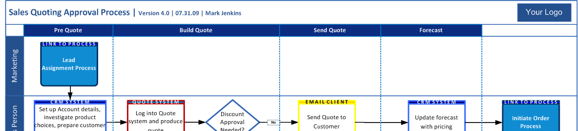
As you will see, a larger paper size than the standard US Letter is generally required; ledger sized paper or larger is ideal, which tends to guide usage of this swim lane adaptation for higher level focus diagrams that illustrate key, stable processes. For example, this approach is not best suited for projects “under construction,” and would be better matched for situations where you want, for example, to mount a finished document to a wall for reference.
The goal of this technique is to portray the process flow as it relates to underlying data while simultaneously identifying the primary data store. This technique facilitates business users’ understanding of report origin and process interrelations, which in turn, procures their comprehension of report generation.
Without further prefacing, let us discuss the aforementioned technique which begins by reviewing the completed swim lane, identifying data change points within the process, and then matching them to a broad-level view of the data. By broad-level view, I mean condensing relevant fields together such as Customer Address, which may be 5 or more system fields, and referencing them under a single umbrella of “Address.” Regrouping applies across all data objects; “Contact Details” may be sufficient to capture “Address,” “Phone,” “Fax,” and “Email”. Reorganizing some of the process boxes may be required, but the increased page size should allow for more freedom.
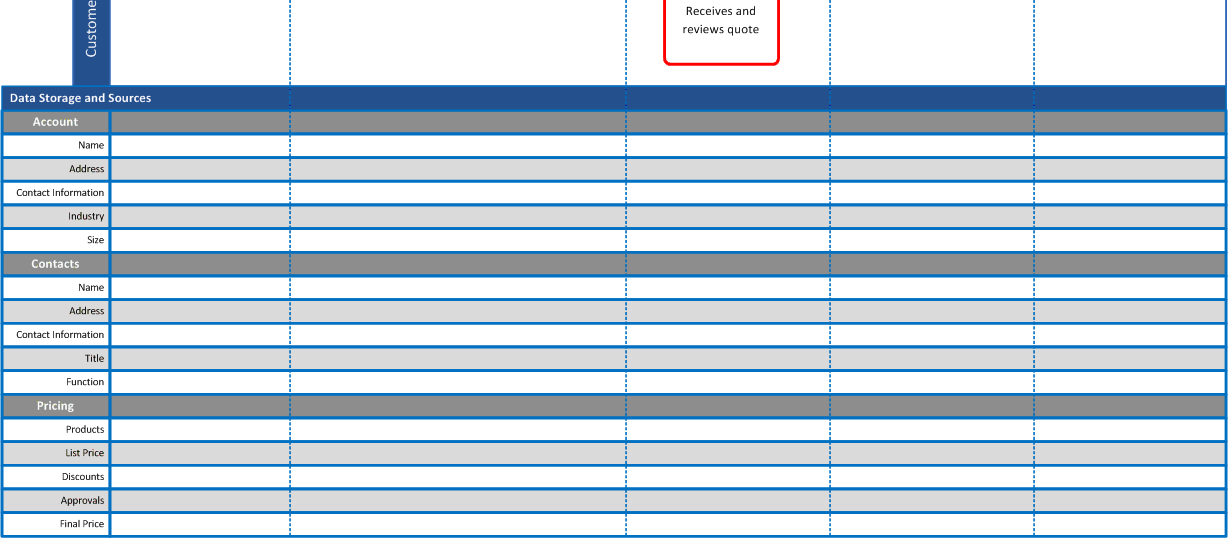
Having identified data change points, I can now annotate the normal swim lane with sections, separated by vertical dotted lines.
At the bottom of the swim lane, data groups are added. In this example, 3 key data points are of interest (of course there are others): 1) Account – the company a customer works for. 2) Contacts – the individual contacts who work at the company. 3) Pricing – the Quote produced by the sales person.
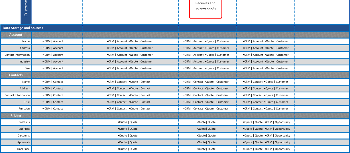
Data storage systems are now added to the intersection of data (X axis) and process sections (Y axis). I typically identify the system of record as the first system in a section. If the system of record changes, I highlight it in red in place it as the first system in the section.
Your final completed diagram might look something like this.
This article has covered a lot of detail. In the first section of this article, we looked out how creating a Visio stencil provides numerous possibilities for collaboration. In the second section, we discovered that adding further detail to a standard swim lane illustrates the underlying data usage of a process. I hope that these two articles have been helpful in lending new techniques and have assisted in the adaptation of your own diagrams.
Don’t forget to post your comments below
Mark Jenkins is Manager Business Analysis Group at Websense. Mark has spent the last year establishing this formal business analysis group that now plays an active role in all major business projects at Websense. As part of the development, he created new process and documentation standards, which assisted in the overhaul of IT Project processes, placing the BA Group at the forefront of the IT to business interactions. He can be reached at [email protected].
Mark would like to acknowledge the help and editorial assistance of Skylar Waldman in producing these articles.