
Author: Mark Jenkins

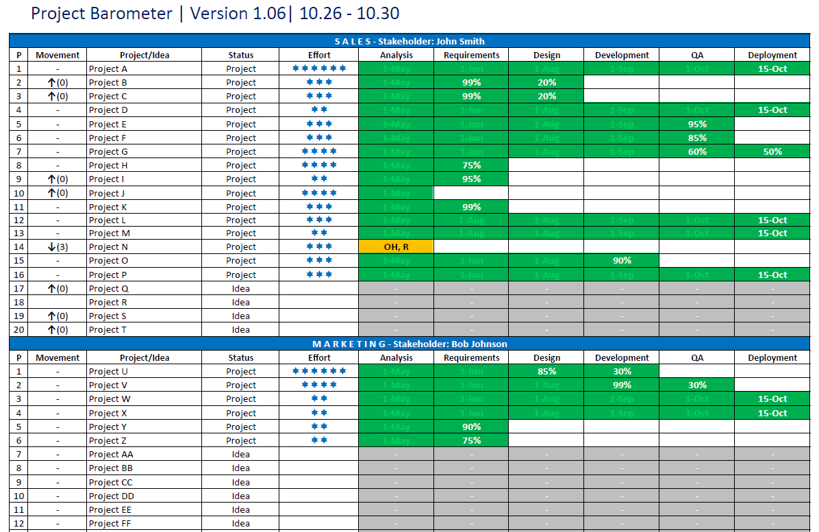
Reinventing the Swim Lane Diagram. Part 1

We’ve all used the swim lane diagram. It’s simple and easily demonstrates a process, but I’ve often thought it could do more. When I document a business process, I want to show more than just who is doing what; for example, indicating which systems they are using, what kind of data they are updating, and illustrating a wider picture of the process. These are all factors that render significantly improved results and refined clarity. In this article we’ll look at some ways we can take the basics of the swim lane diagram and add some heightened functionality.

In this first part, we’ll cover a method of demonstrating process and systems interaction within the style and template of a traditional swim lane.

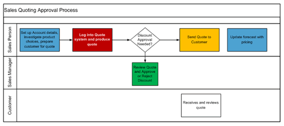
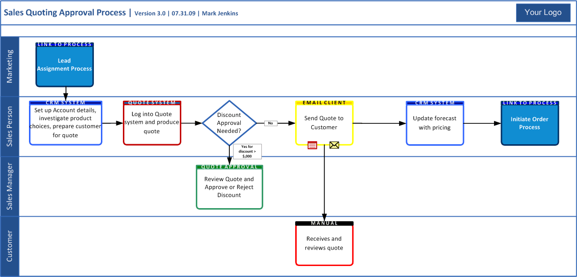
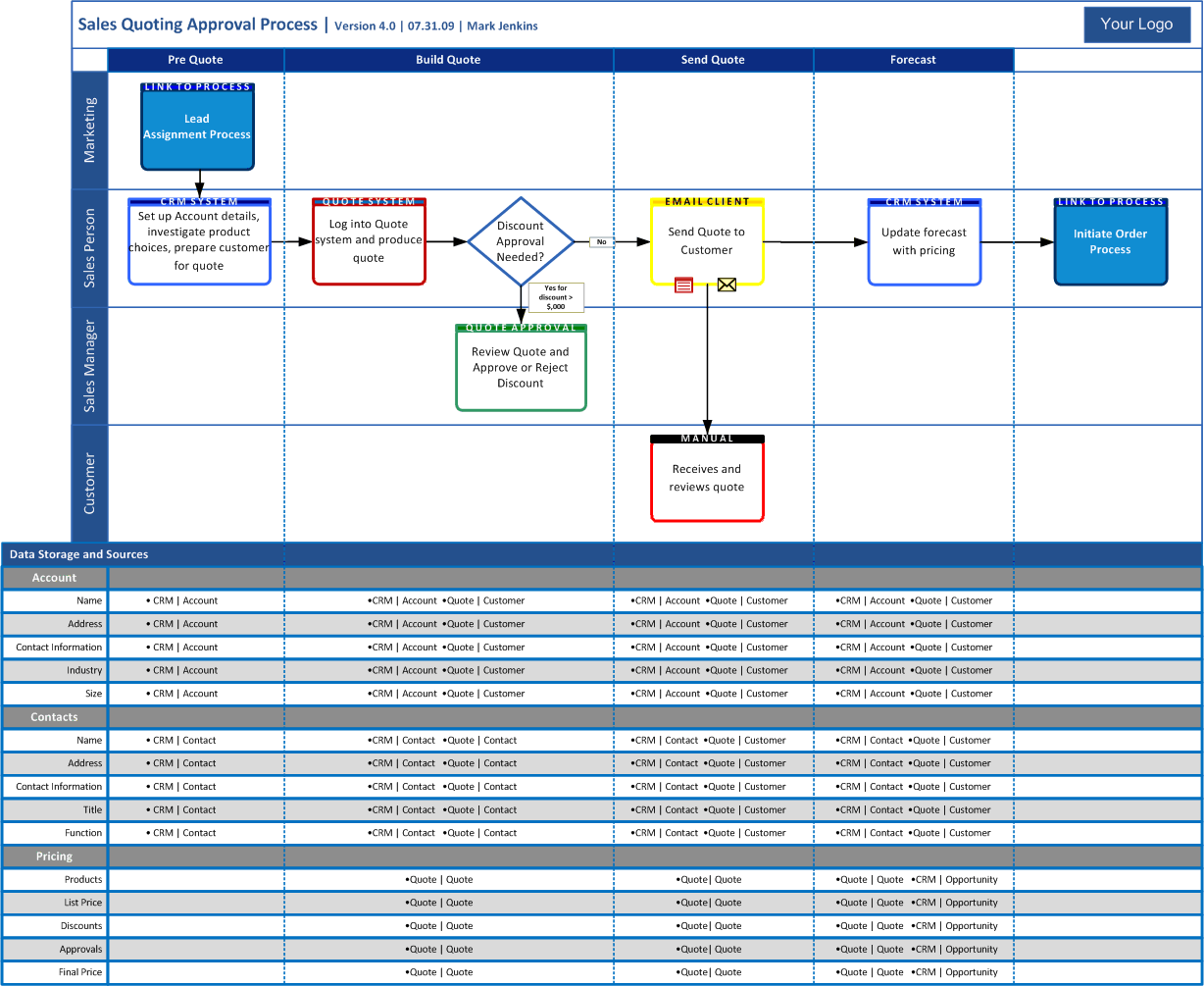
Let’s pause first to set the scene with a typical process swim lane for a sales quoting approval process. In this process, let’s imagine that there are four different systems: the Sales Person working in their CRM system, quoting tool and email client, Sales Management in an approval tool.

Does the swim lane below really demonstrate this clearly?

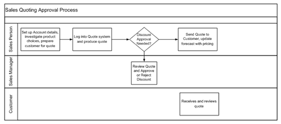
In this diagram, it’s difficult to realize at a glance, that the Sales Person has three separate systems (in many organizations this can also mean three separate logins). As a result, it doesn’t accurately demonstrate the amount of work the Sales Person might need to do to produce a quote. In fact, on the face of it, the quote approval process looks simple!

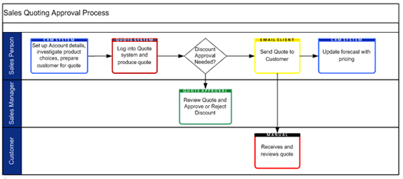
So what can we do to make it more readable? One option would be to color code the boxes to show the different systems, as follows:


Again, this diagram seems to work by color coding the different systems, but what really ends up happening? One might think, “Wow, nice colors, what do they mean?” So, similar to the first diagram, we are left with unanswered questions and an ambiguous picture of the process. Legends, too, seem to just add to the confusion.

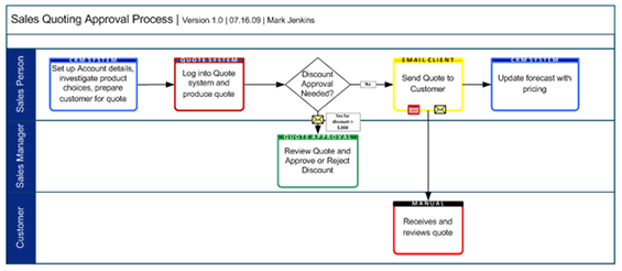
Let’s look a little deeper. Colors, although effective in distinguishing difference, in the above example require a legend. If we could make more economical use of color and eliminate the need for the legend, things would be better. The diagram below does just that. By using color in the border and including a colored label, you can simply differentiate the systems (i.e., adding the system name to the label eliminates the need for the legend).

Now you can clearly and quickly see that when the Sales Person creates a quote, they have to actually use three different systems, with a fourth system used by the Sales Manager for approvals. All this is achieved without the need for a legend and I haven’t confused the reader with lots of overwhelming colors.


Finally, I can also annotate to add some further details. In this example, I am sacrificing some readability for a deeper understanding; however, in this case, I think it works. Using an email icon, I annotated both the Quote Approval and Email Client. The approval discount condition is also annotated.

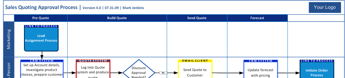
Every diagram should have a version number, ideally a date and an author. This will ensure that when you use the diagram, in a presentation or a meeting, you can guarantee everyone is referencing the same information. A date allows you to see when the diagram was last updated, and the author serves as a reference if the diagram is used elsewhere in the organization.


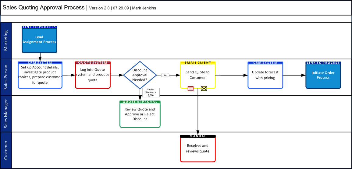
In our company, we have set up our process diagrams using a Visio stencil, creating a template for repeated use. The parameters of the template include clearly defined color coding schemes for all major systems (green means finance, blue means sales, etc) with regular color mapping to other types of diagrams (i.e. system diagrams, data flow diagrams, etc.) Over time, business users recognize these colors, and find this an effective way to illustrate when a business process requires the use of multiple systems (as shown in the example). It also indicates where there is systems overlap between departments (e.g. when a Sales Person interacts with a Finance-based system).

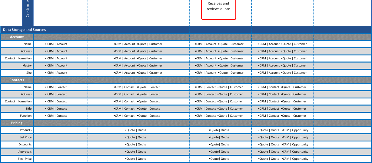
To summarize, we’ve concentrated on ways to increase the effectiveness of the swim lane diagram. The sparse and efficient use of color, defining each color’s meaning, and the introduction of labels and annotation allow for a more profound exchange of information. In Part 2 we’ll start to explore further additions to the swim lane diagram for tracking the underlying data usage, and investigate methods to clarify swim lane diagrams when put into a context of the wider picture. We’ll also talk about having now set up a basic swim lane template, how we can then increase adoption and maximize the use of it.

Don’t forget to post your comments below!


Mark Jenkins is Manager Business Analysis Group at Websense. Mark has spent the last year establishing a formal Business Analysis Group at Websense that now plays an active role in all major business projects. As part of the development, he created new process and documentation standards, which assisted in the overhaul of IT Project processes, placing the BA Group at the forefront of the IT to business interactions. He can be reached at [email protected]

Reinventing the Swim Lane Diagram. Part 2.

Please click on any image to view an enlarged copy

This article is a continuation of the “Reinventing the Swim Lane Diagram” process. Part 1 concentrated on ways to increase the efficacy of the swim lane diagram. Methods such as using color in a sparse and efficient manner, clearly defining each color’s meaning, and the induction of labels and annotation led us to realize to a more profound exchange of information.

Before we start Part 2, let me take pause to respond to some of the feedback from Part 1.

With any diagram, standard or best practice, it is vital to ensure that whatever you use, it’s appropriate for your audience. The typical audience for my swim lane diagrams is business users. At Websense, we are lucky to have an architectural and design group to handle the technical interpretation of business requirements. My group concentrates on understanding how a process is performed today, and then working with business users to decide how it is going to work in the future, providing insight into the complexity of the process. For the business stakeholder, the system they use of the utmost importance as it is a major contributor to their success. For example, performing a process in the slick CRM system might be a very different proposition to the clunky Quote System. We use the template for both “as is” and “to be” process documentation; and we generally communicate it through an analysis review or in the context of the final requirements document, although the diagram has its own standalone value.

In addition, my goal in Part 1 was to create a mock diagram, from which you could conjure ideas for a variety uses and applications, each tailored to individual demands.

In Part 2, I’ll explore some further additions to the swim lane diagram, which will help place a process in the context of a wider business picture. I’ll also cover how to increase and maximize the use of the swim lane by creating a Visio stencil. I’ve decided to add a Part 3, where I’ll cover an effective way of demonstrating the underlying data in a simple format, which builds the swim lane further.

The finished diagram from Part 1 is used again in this article.

Scott had mentioned in his comment about Part 1 that it is important to show the inputs and outputs of a process, and I agree. I achieve this by adding “process link” boxes, again with an appropriate color and label.

In the example below, I added the start feed as well as the output. For the detail-oriented, I also updated the version number and date.

swimlane1

This diagram now easily shows a Marketing start process as well as an output order process, initiated by the sales person. You could also consider annotating the bottom corners of the process boxes with numbers, but I think it’s unnecessary unless you had multiple start points or confusing decision trees.

In order to increase and maximize the use of the swim lane diagram, I’ve found it effective to develop a Visio stencil. Creating a Visio stencil for this purpose can “template” or “palate” shapes for use in future designs, therefore drastically reducing the time it takes to create swim lane diagrams.

Make sure you have the majority (if not all) of your systems identified beforehand, this will help you when choosing color groups. If you are using a Visio stencil in group environment (i.e. a team of BA’s) then proactively meet and set up the stencil together. This should prevent divergence when you later come across a new or overlooked system. Using primary colors to designate certain system groups is also effective. For instance, you can use different shades of your primary color to indicate systems which “hang off” of a main system, as shown in the example below.

swimlane2

If your group has a team logo and/or a company logo, add this to the swim lane frame (which we also created as a stencil shape).

Another nice touch is to use the company color scheme on the frame borders and swim lane headers.

These two small points allow you to produce something that looks official, which adds major percentage points to the credibility of the diagram. You can end up with final version of the diagram that looks something like this.

swimlane3

The great advantage of the Visio stencil is that it provides a framework on which you can build tailored stories that clarify process meaning and purpose. The first step, for my group, was to consistently use, adapt and improve the stencil. At this stage, you are basically road testing, ensuring that you have included everything you need. As the diagram is used in documentation or meetings, you are generating awareness and hopefully interest in the diagram. The business users’ benefits of seeing a consistent diagram format are also significant, reducing the comprehension time of changing diagram formats.

Once you’ve ironed out the kinks, got BA’s or colleagues consistently using the diagram, and your stakeholders comfortable reading it; you can start to drive it as a company standard for documenting business processes (keeping in mind my first point: use it when it makes sense and is appropriate to do so). For my group that meant building a store of business processes that can be accessed by the business stakeholders across the company. We also published the stencil to our Sharepoint team site, with instructions on how to install and use it (this assumes that you have enough users with Visio knowledge), so anyone can create their own process flows. This sort of implementation creates a language in which all involved are fluent. There really is no more powerful tool for a BA than having stakeholders able to express themselves using BA documentation standards.

For the majority of business users, this is as deep into the swim lane as you would want to go. We’ve pushed up the boundary of what I think most users can realistically comprehend, but for BA’s and technical users, there’s even more detail we can add to a swim lane base, to track data use within a process.

A lot of information will be displayed within a single diagram, so it is important to keep in mind that when using this technique, the audience and situation must fit.

In the following example, there are likely to be alternative techniques to demonstrate data usage, but again, the goal of my article is to challenge the standard way we look at diagrams.

As you will see, a larger paper size than the standard US Letter is generally required; ledger sized paper or larger is ideal, which tends to guide usage of this swim lane adaptation for higher level focus diagrams that illustrate key, stable processes. For example, this approach is not best suited for projects “under construction,” and would be better matched for situations where you want, for example, to mount a finished document to a wall for reference.

The goal of this technique is to portray the process flow as it relates to underlying data while simultaneously identifying the primary data store. This technique facilitates business users’ understanding of report origin and process interrelations, which in turn, procures their comprehension of report generation.

Without further prefacing, let us discuss the aforementioned technique which begins by reviewing the completed swim lane, identifying data change points within the process, and then matching them to a broad-level view of the data. By broad-level view, I mean condensing relevant fields together such as Customer Address, which may be 5 or more system fields, and referencing them under a single umbrella of “Address.” Regrouping applies across all data objects; “Contact Details” may be sufficient to capture “Address,” “Phone,” “Fax,” and “Email”. Reorganizing some of the process boxes may be required, but the increased page size should allow for more freedom.

Having identified data change points, I can now annotate the normal swim lane with sections, separated by vertical dotted lines.

swimlane4

At the bottom of the swim lane, data groups are added. In this example, 3 key data points are of interest (of course there are others): 1) Account – the company a customer works for. 2) Contacts – the individual contacts who work at the company. 3) Pricing – the Quote produced by the sales person.

swimlane5

Data storage systems are now added to the intersection of data (X axis) and process sections (Y axis). I typically identify the system of record as the first system in a section. If the system of record changes, I highlight it in red in place it as the first system in the section.

swimlane6

Your final completed diagram might look something like this.

swimlane7

This article has covered a lot of detail. In the first section of this article, we looked out how creating a Visio stencil provides numerous possibilities for collaboration. In the second section, we discovered that adding further detail to a standard swim lane illustrates the underlying data usage of a process. I hope that these two articles have been helpful in lending new techniques and have assisted in the adaptation of your own diagrams.

Don’t forget to post your comments below


Mark Jenkins is Manager Business Analysis Group at Websense. Mark has spent the last year establishing this formal business analysis group that now plays an active role in all major business projects at Websense. As part of the development, he created new process and documentation standards, which assisted in the overhaul of IT Project processes, placing the BA Group at the forefront of the IT to business interactions. He can be reached at [email protected].

Mark would like to acknowledge the help and editorial assistance of Skylar Waldman in producing these articles.

Working with Business Analysts Made Easy

Working-with-Business-Analysts-Made-EasyOver the last few years, many people have asked me for tips, techniques and skills you should develop when managing a group of business analysts. This article is an informal list BA managers might consider, especially if they are transitioning into management from a Business Analyst role.

Develop a BA Process

Provide a framework to which all your BAs work. Not only does this give them a consistent approach, but you a get a consistent way to assess their progress. Business stakeholders and IT staff should recognize a similar pattern in every project. In doing this, you are also training your stakeholders to think like a BA. After repeated exposure, they can foresee the next steps and come more prepared to meetings and projects.

Develop Consistent Tools and Standards

One of the worst things for a business user or developer to see is different documentation standards from each BA. I insist that everyone uses standard templates and adopts a consistent approach to diagrams and other supporting information. Be sure to make your templates flexible and try to refrain from producing overwhelming or heavy documents. I encourage BAs to try to separate documents as logically as possible. Having a functional requirements document full of use cases, mockups, data specifications and a report catalogue can quickly become a 100 page+ document and business and technical staff struggle to read it.

Get Involved in Planning Projects and then Leave the BA to it

One of the realizations when you move into management is that you cannot be everywhere all the time. More importantly, you understand that you don’t want to be everywhere all the time! It’s challenging when you move from being responsible for your own projects, running meetings and getting involved in as much detail as you like, to only having time to view projects from the periphery. One of the methods I use to stay involved, but not participate on a day to day basis, is to work with the BAs at the start of the project, to ensure they plan their efforts and evaluate the scope of their projects in a consistent and clear manner.

The scope evaluation typically takes the form of what I refer to as Power Verbs. These are the action points that you can then use to maintain your sense of the project. For example, if the project was to move house, the Power Verbs might be Investigate, Decide, Prepare, Pack, Move, Unpack, Recover. I would then spend time to expand each Power Verb into a series of action areas. These action areas then allow the BA and the manager to ensure that a project starts off with a clear understanding of potential scope. For the manager, this affords an opportunity for context any time they need to get involved, because they a basic understanding of the overall process.

By overseeing planning and providing a solid framework within which the BA can operate, the BA is free to use their own techniques and methods, while the manager is comfortable knowing the scope will be addressed.

Resource Your Team Well and Review it Constantly

One of the major areas of challenge for a manager is resource management, especially in fast paced environments. I use a tried and tested technique which I documented here, it has not failed me yet. However, regardless of which method you use, you need to find the right resources and resist the temptation to take on projects or problems yourself. It is not ideal if you assign a BA to a project and then they have to leave a few days later, because you forgot they were required on something else. I find that BA’s max out on 2 large projects or 3-4 smaller projects at any one time, any more and they lose the consistency needed to stay focused and add value. You will also want to track the time spent utilized vs. down time, as this will be a key measure in your demonstration of your success in resourcing your team.

Find a Way to Reduce BAs Moving from Project Area to Project Area

If a BA has to move business areas on each project, you will easily waste time unnecessarily as they need to ramp up to a new environment each time. To prevent this, assign your BA’s to a business area or project type and try to keep them there. As the BA gains experience they become more familiar with the stakeholders, processes and systems, they will reduce ramp up time to zero and add more value to the project. On a yearly or bi-yearly basis, try to switch the BAs around to keep them learning and developing.

Over Invest in Recruitment Efforts

Many managers are nervous about interviewing and recruitment and as a result hire the wrong candidates. If you are hiring BA’s, think about the qualities your candidates should demonstrate and try to use behavior based questions that call for specific examples. I will typically ask BA’s to do a live iteration exercise or some other activity relevant to the job to get a better sense of their real world performance. It’s better to take your time to hire the right skill set than to rush and hire the wrong person.

Don’t Forget the HR side

Being a good manager requires skills that you may not have developed as a Business Analyst. To make it harder, BA’s are usually smart people and need a specialized management style. They generally hate micro-management, are creative, and by nature are always finding problems that you’ll need to develop into opportunities. Encourage a collaborative style and get them involved with how the group progresses.

Meet as a Team Regularly

Schedule a weekly or bi-weekly meeting to talk about projects and status. You’ll find numerous instances where BA’s are overlapping or suffering from a similar pain point. Talking about these issues in a group format allows everyone to learn for very little effort.

Develop the Skills of your People to Improve Team Performance

Invest in team training but identify the skill deficiencies at the individual level. There’s really no point to sending your whole team on a use case course, if only one of them doesn’t know how to do them. Also, get creative and proactively look for free webinars and events. One of the easiest ways to develop a sense of where each BA is at is to create a competency model, specific to your process and to your environment. Use the competency model to guide where a BA needs help and improvement. It is also a great tool for managers to show leadership how the group is developing over time.

Establish Membership with the IIBA

Sounds expensive but it isn’t at all. $95 per BA for the year and you have access to a wealth of information and potential connections. The corporate membership is also a great deal and isn’t that much more expensive.

Don’t Forget your Stakeholders and Customers

As a manager, you represent your group to the wider organization. You will need to develop and maintain partnerships with your customers, especially the challenging ones. Enterprise Analysis is a great way to stay engaged as a BA Manager, but inevitably you are now going to focus on your relationships with stakeholders, ideally higher up in the organization. Don’t forget that the judgment of your success often lies in the perception your customers have of your group. It’s helpful to research how effective account, product or relationship managers operate, to give you some tips and techniques in this area.

Also, don’t forget to get to know your new peers. Build new relationships with the other managers you work with. Find out the pain points they have with your team and offer to help by changing things that aren’t working.

Change your Relationship with your Manager

You will now have a different working relationship with your manager, possibly even a different manager entirely. You have to recognize that there is more of a strategy element to the management role than was required for your role as a BA. Focusing purely on tactical and not strategy is going to quickly disrupt progress. One of the key documents to develop is a road map for your group, set some goals, establish a timeline, get all your team involved and then manage to a plan.

Remain Positive, be Enthusiastic, Lead by Example

As the leader of your group, your actions and demeanor have an instant impact on the moral of your team. Your staff will be looking to you for leadership and you need to respond accordingly. When you interact with BAs in project teams, live, breathe and demonstrate the development you want to see in them. Don’t forget to reward your staff for a job well done, even if all you can afford is a thank you, it’s a great place to start!

To conclude, while this article is not exhaustive list of everything you need to manage BAs (nor will that list ever be completed) but I hope it has given you some ideas. Remember, there is really no need to start from scratch as you mature your team and develop your management skills. The internet (Twitter, IIBA, Bridging the Gap etc) and people going through similar experiences are great sources of information. LinkedIn is also a great way to connect with colleagues, it’s also a really great way to recruit!

Don’t forget to leave your comments below


Mark Jenkins is the Associate Director of Business Analysis at KPMG. Mark leads a team of 20+ Business Analysts at KPMG in a Center of Excellence format. Prior to KPMG, Mark established a highly successful Business Analysis group at Internet Security leader Websense. Mark draws on his 8 years of Business Analysis experience, including numerous CRM initiatives and a wide range of projects, across all business areas. He can be reached at [email protected] and on twitter www.twitter.com/JenkoUK. Mark is also the Regional Director for the Americas Eastern Region at the IIBA and will be speaking, as part of a panel discussion, on Building a BA Career Center of Excellence at the IIBA Conference in October


Reinventing the Program or Project Portfolio Chart

The fourth and final part of my “Reinventing…” series (which ran in Business Analyst Times earlier this year; see links at end of article) concentrates on a project portfolio rollup chart. Since this charting technique also includes and tracks business priority, I call this communication tool the “Project Barometer”.

As with the previous articles, the chart attempts to maximize the amount of information a single diagram can communicate, without overwhelming the reader. However, unlike the previous techniques, which required the use of Visio, the barometer takes advantage of the simplicity of Excel.

For a BA who is actively involved in managing an IT to business relationship, questions regarding project status and upcoming effort are common. I use updates from my team as well as updates from other groups to collate a chart that helps to quickly respond to such prompts as, “What are you guys working on?” or “What is the priority of this project?” by providing relevant information at-a-glance. The aim is not to provide a detailed breakdown of the status of each project; that is better left to your project management team, but to use the Barometer as a communication tool to assist a stakeholders understanding of your IT program at a macro level.

The development of upcoming priorities is also something the barometer tracks effectively; my BA team is also tasked with managing the upcoming IT workload, forming a demand queue through turning stakeholder ideas into project proposals. As such, we use the Project Barometer to help prioritize these stakeholders’ ideas, which we then communicate to the IT management.

Lending a greater level of visibility before a project gets off the ground, the Project Barometer helps individual departments to align themselves with and keep focus on current efforts.

A key part of the BA role is to pinpoint areas of project neglect (areas where a project may have missed stakeholders or scope, downstream impact, etc.). This tool has proved extremely valuable, both in department reviews and, in a more proactive sense, for stakeholders or departments to view at will. I have also found this technique equally appealing to executives and individual contributors for the facile communication and information transfer it procures. Without the Project Barometer chart, our BA team would not be as effective.

When designing this chart, I thought about some of the common problems faced by IT employees, managers and business stakeholders. Typically, project status updates take the form of multiple page documents, PowerPoint presentations and/or meetings to deliver this information, which can be difficult to navigate and time consuming. Although highly detailed reports serve a valuable purpose, the Project Barometer extracts relevant information from those reports and organizes it in a simple, unambiguous chart made accessible to all involved parties. As response to questions regarding status, priority, and effort, the Project Barometer provides immediate information in a concise, visual manner. Such an at-a-glance informational tool becomes ever more important the higher up the corporate ladder you go.

With those parameters in mind, I wanted to find a way to fit an entire program status on a single page. The Project Barometer is a result of these efforts.

reinventing-ppp-1sm
View Larger

My barometer consists of 11 columns, which, in order from left to right, track priority, project name, project status, effort and the stages of the SDLC.

The rows are filled with the individual projects grouped together by department. The Sales and Marketing groups are shown here, each separated by the blue bars.

Within each cell, a coding scheme is used to communicate relevant information, I include a legend at the bottom of the barometer but, for the most part, it is self explanatory.

reinventing-ppp-2sm
View Larger

In this next part of the article, I’ll provide a step by step guide to building your own barometer.

The easiest way to begin is to list all of your projects currently in progress. For each project, think about the amount of effort involved and which group owns which project. The grouping of projects by department is one of the things that make the barometer useful.

At the end of this effort you should have a list of projects, grouped by department and assessed for effort, such as the example below.

reinventing-ppp-3

The next step is to think about the stages you track in your SDLC, typically it will be something like the completed barometer shown above, but because Excel is so easy to use, you can adjust the columns as required.

reinventing-ppp-4sm
View Larger

It is now a simple exercise to add either the date the stage was completed or the percentage of completed progress to the individual cells.

reinventing-ppp-5sm
View Larger

It would be reasonable to stop here and have a functional chart, but as we saw above, there is more information we can communicate. In order to make the chart easier to read, I grouped the projects together by department. To do this I simply merge a row of cells and then, for each section, add and repeat the headers. Moreover, I add the key stakeholder for each department; this is the person you would work with to set the priority of each project.

reinventing-ppp-6sm
View Larger

To communicate a clearer idea of progress, we can apply colors to the stages. We’ll follow the standard traffic light format, green for good, amber for minor issues, red for major issues. If a stage has been completed, I always set it to green.

reinventing-ppp-7sm
View Larger

During my barometer design, at this point I didn’t feel like the chart was providing as clear a picture as possible because I had all the stage progresses annotated the same way. It makes it hard to differentiate, at-a-glance, between completed and in-progress efforts. To eliminate this problem, when a stage is completed, I change the text color to a light green. This has the effect of making the white, in progress stage, stand out more. As you progress to making larger barometers with a greater number of projects, this effect will become more vivid.

reinventing-ppp-8sm
View Larger

We now have a completed diagram mapping the current program status, but what about priority? What about upcoming ideas? As I demonstrated above, this can be built into the same diagram with minimal effort. To tackle priority, I simply add two columns, one labeled “Priority” which tracks position (position one should be the most important project to the stakeholder), and the second column labeled “Movement,” tracking any priority changes. The addition of these two columns makes the barometer a great negotiation tool.  Combining the Project Barometer with the Resource Chart forms a powerful arsenal of persuasion, with the odds stacked in your favor.

Dealing with the practicality of keeping the chart current, if a project is added with a higher priority than existing efforts have or a project priority is downgraded, I generally only show the movement of the added or downgraded  project (i.e., I don’t show the shift in movement through the list of each of the others).

reinventing-ppp-9sm
View Larger

Adding and prioritizing upcoming ideas or requests is also easily facilitated. Add an extra column for status, add the ideas and then update as needed. You could also track any kind of status here. You may have a designation for small projects and large projects, for example.

reinventing-ppp-10sm
View Larger

The diagram is now nearly complete, once the version and date range are added. I typically update at least three times a week.

In summary, we have again created a simple but highly readable diagram to demonstrate the current status of projects and ideas, and in so doing, provide a complete picture of the program.

I’ve received some positive feedback on this series of articles, so thank you for taking the time to read and reply with your comments. In the majority of emails, I receive requests for a template. Now that I have finished the series, I’m working on bundling the templates and stencils into something you can all download.

http://www.batimes.com/component/content/article/106-articles/453-reinventing-the-swim-lane-diagram-part-1.html

http://www.batimes.com/component/content/article/106-articles/463-reinventing-the-swim-lane-diagram-part-2.html

http://www.batimes.com/articles/106-articles/490-reinventing-the-resource-chart.html

Don’t forget to leave your comments below


Mark Jenkins is Manager Business Analysis Group at Websense. Mark has spent the last year establishing this formal business analysis group that now plays an active role in all major business projects at Websense. As part of the development, he created new process and documentation standards, which assisted in the overhaul of IT Project processes, placing the BA Group at the forefront of the IT to business interactions. He can be reached at [email protected] and on twitter www.twitter.com/JenkoUK

Reinventing the Resource Chart

Click on small images to enlarge

As we continue to examine traditional tools reinvented to establish effective communication, let us look at the resource chart. I’ve seen varying approaches to resource charts such as using graphs, spreadsheets, and Gantt charts; and while each of these methods yields results, the approach detailed in this article will improve the amount of information communicated in a single resource chart rather than using multiple diagrams. In short, this article concentrates on a technique that portrays layered meaning in a single chart.

As with the swim lane diagram, discussed in two August issues of Business Analyst Times, (http://www.batimes.com/articles/106-articles/453-reinventing-the-swim-lane-diagram-part-1.html) the resource chart will be constructed using Visio, replete with stencils, which will accelerate chart design time. This technique for creating resource charts serves four main goals:

  1. to communicate what my team is currently working on, what we have completed, and which projects are scheduled to commence;
  2. to provide insight into time spent on each individual project;
  3. to give guidance about the status ofan individual project;
  4. to facilitate,through a single diagram,the percentage of available time for each team member.

If you have similar goals then you should find this technique quite useful. I should point out that my team generally works on simultaneous projects tracked over a maximum three month period. In addition, this technique isn’t a way to define an actual end date (I use MS project for that).

Using some of the basic concepts of the previously discussed swim lane diagram, each team member is assigned a lane, referred to as a “resource lane.” Added to the header, along the x axis, are annotated blocks to represent periods of time. Two week blocks are appropriate to my situation, although individual adjustments can easily be made. Using a typical paper size, landscape oriented, the two week blocks line up nicely with financial quarters (three months of the year). Here, as with the swim lane, a version and author are very important. To ensure that the same version is being used by all, I update my resource chart at least a couple of times a week.

reinventingtheresource1-sm

Now I add the resource lanes for each group member. Each of the resource lanes are used to demonstrate an individual’s allocation to a particular project or effort, which is shown as a percentage along the Y axis

reinventingtheresource2

and measured in time along the X axis.

reinventingtheresource3-sm

In the following example, I will demonstrate using four team members with their corresponding resource lanes.

reinventingtheresource4-sm

All the components of the diagram used so far can be added to a Visio stencil, which allow future charts to be created quickly. In a moment, we will fill in the detail, but first let us build the legend to define it.

reinventingtheresource5-sm

The legend is divided into three main columns. Within each column are three possible measures, represented by boxes in various shades and patterns, referred to as resource bars.

The first column resource bars (colored green, amber, and red) demonstrate if an effort is on track. When a project is completed, the resource bars should all be green.

The second column resource bars demonstrate proposed/future scheduling that is yet to have an accurate time line, allowing vacation, business travel, and out of office time to be booked out.

The third column resource bars identify regular tasks, the current date, and items that are in queue but not yet defined.

These resource bars, annotated using the appropriate color and style will be added to the resource lanes, at the appropriate dates (x-axis) and percentages (y-axis), to show how long an effort will be sustained.

Starting with Mark, in July he worked on three projects simultaneously (maybe after reading the Bad-Ass BA series…!). Project A took up 25% of his time, Project B 50% and Project C another 25%, for the whole of July. As a result, Mark’s resource lane, with three resource bars, would look something like this.

reinventingtheresource6

It is more likely though that resourcing realities will produce situations where projects are completed at different times, potentially freeing up more resource availability. For Mary, this was what happened during July. She worked on two projects, one project for two weeks at 30% and then her remaining time in July was taken up on another project. Her resource lane looked like this.

reinventingtheresource7

Adam has a regular task that takes up 25% of his time, such as allocation to support tasks, project roll-outs etc. This resource bar is stretched along the entirety of the resource lane, using the appropriate color as per the legend. He also took a week of vacation at the start of July, after which he worked on a project which, at the time, had some minor issues.

reinventingtheresource8

I’ll fast forward a little and fill out the rest of the resource lanes, to bring the diagram to the current date (Aug 25th)

reinventingtheresource10-sm

We now have a clear picture of the teams resourcing. We can see that two of the projects in the group have some issues. We can see vacation schedules, business trips and can now easily demonstrate what the group is working on, down to the individual level.

One of the major strengths of this technique is that it is great for planning. You can easily identify when resources will come available. You can actually plan, at a basic level, as far out as you like. I use a different color and designation for planned effort that I have a rough or S.W.A.G. idea of how long it should take. These speculative resource bars are added to the resource lane.

reinventingtheresource11

Adding further to planning possibilities, you can also begin to assign projects not yet defined, or in a future queue.

reinventingtheresource12

Finally, to further aid the reader, a line representing the current date is added which makes it simpler to see where current date is, in comparison to the data.

reinventingtheresource13

The diagram is now complete and so we have created a simple but highly readable chart to demonstrate how a team and/or individual is resourced, has been resourced and will be resourced. In adding the current date line (vertically, in red) the diagram posits a more real time view, which is perfect for a team web site and/or regular distribution fulfilling weekly or daily status reports.

As I mentioned at the start of the article, the four main goals for this diagram were achieved through this layered approach to the resource diagram. Over time, I have realized another major benefit from using this approach whereby employing this diagram prevents my team from being swamped by a deluge of new projects that are awarded high or immediate priority. In such a situation, the stock approach as a manager or executive is to immediately assign a team member to work on this new, high priority project; however, this new resource chart enables the manager to negotiate realistic work loads and time lines to sustain a balanced work flow. A manager is now deftly able to present how an effort should to be prioritized or scheduled by way of a visual aid that is universally understood.

Upon completion, the final illustration in this example looks like this.

reinventingtheresource14-sm

Don’t forget to leave your comments below


Mark Jenkins is Manager Business Analysis Group at Websense. Mark has spent the last year establishing a formal Business Analysis Group at Websense that now plays an active role in all major business projects. As part of the development, he created new process and documentation standards, which assisted in the overhaul of IT Project processes, placing the BA Group at the forefront of the IT to business interactions. He can be reached at [email protected]