Requirements In Context Part 3: Scope = High-Level Requirements
The first article in this series established the context of requirements being addressed are those that relate to business information systems and that various contexts have an impact on those requirements. The second article addressed the first of these contexts – Functional. That context was further divided into three conceptual levels labelled Functions, Processes and Activities. An example high-level requirement was presented at each of these levels.
Project Scope
This article moves on to a different context – Project Scope. We will see how scope statements, when making reference to business functionality, leads directly to high-level requirements.
Gathering requirements for a business information system is most often done within the context of a project. Approval of a project includes its sponsors signing off on its scope. The scope of a business information system project is typically defined in functional terms. Items in scope make reference to (or should make reference to) business functions, processes and/or activities that are to be delivered.
Related Article: Using Feature Trees to Depict Scope
A Context Diagram Is Worth A Thousand Words
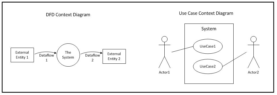
In addition to the bulleted item list of scope, it is very common for the project initiation document to include a context diagram. The objective of a context diagram is to illustrate what is inside the system and what is outside. Things outside the system represent sources and/or consumers of data. The original form of context diagram comes from Dataflow Diagramming (DFD). The top-most level of functional decomposition using DFDs was considered a context diagram. The Unified Modelling Language (UML) Use Case modelling also supports a form of context diagram. Both of these diagramming techniques represent ‘the system’ and both portray things outside the system boundary. The DFD term for these outside things is External Entity. The UML term is Actor. The definition of these two terms is virtually identical.

A DFD context diagram says nothing about the functions inside the system. That is left to subsequent levels of functional decomposition. Clues are provided by labels given to the data flows. The Use Case context diagram provides more of a clue to the functions within scope by including named use cases. Data flows in a DFD context diagram connect only to the system. Actor connectors in a Use Case context diagram connect to one or more specific use cases within the system.
High-Level Requirements From Project Scope
Examples of high-level requirements were presented in the previous article based on a high-level business function, a medium-level business process and a low-level business activity. We are about to present an example of a project and its scope. As mentioned above, the scope of business information system projects is very often expressed in functional terms. It should, therefore, be possible to derive high-level requirements from scope items.
Consider the following situation involving a large hypothetical on-line retailer we will call Nile.com:
Nile.com has a well-established purchase process for its on-line customers. The check-out portion of this process includes activities for identifying the intended shipping address and for providing some form of payment. What the process does not currently include is anything to do with tax on items being purchased. As the result of pressure from various tax authorities this needs to change.
In establishing a project to deal with this change in the business environment the following scope items were agreed by the business sponsor and signed off:
- Maintaining tax-related details for designated tax authorities
- Determining applicable tax on items being purchased
- Including applicable tax with purchases
- Accounting for tax charged
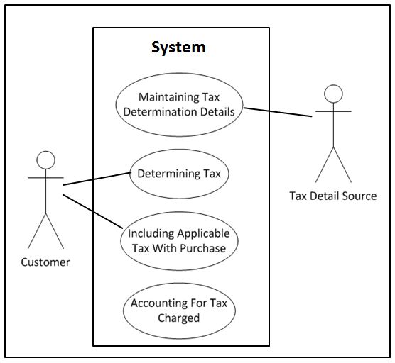
The Use Case form of context diagram for this example would look like this:

Scope items will seldom be stated so conveniently that they can be converted one-for-one into the names of use cases. For the sake of brevity, please accept that the scope items in this example are “ones that I prepared earlier.”
The objective of this article is to show that it is possible to derive high-level requirements based on a project’s scope. The following are examples of such requirements from the scope in this scenario:
Scope Item 1 – Maintaining tax-related details for designated tax authorities
The system shall support an administrator maintaining tax-related details required to perform tax determination. This includes establishing tax authorities that are the source of tax rates and to whom collected taxes need to be paid. It also includes mapping of products to tax rates for each authority where there are product-specific rates or specific product types that are tax exempt.
Because charging tax is new to this organisation there may not be an in-house subject matter expert available when it comes time to sorting out the details for this requirement. Until more is known this high-level requirement acts as an appropriate placeholder for what is likely to be a number of business processes. One would likely be needed for setting up new tax authorities, one for setting up the tax rates and where applicable, one for specifying different rates for different product types. The requirement from a business perspective is fairly straight forward – maintain whatever details are necessary to be able to charge tax. The devil is in the detail.
Scope Item 2 – Determining applicable tax on items being purchased
The system shall be able to identify the appropriate tax that applies to the purchase of a given product based on the product type and the tax authority(s) that have jurisdiction where the shipment is to be delivered.
Where the previous requirement calls for wholly new business processes to be supported within the business information system, the functional context of this requirement would be somewhere within the “Identify the shipping address” activity within the “Purchase” process. At this point the product(s) are known, and the shipping address details can be used to determine any applicable tax authority(s). Subsequent detail requirements would get into how an appropriate tax rate is determined and specifics of where that rate is used in calculating the total charge to the customer.
Scope Item 3 – Including applicable tax with purchases
The system shall present to the customer all applicable tax amounts as part of the purchase process.
This statement should be sufficient as a high-level requirement from a business perspective. Part of the detailed requirements analysis would include identifying all of the places where the customer ‘sees’ purchase price details. Each of those places will require modification to include whatever tax applies, if any.
Scope Item 4 – Accounting for tax charged
The system shall report charged tax amounts as a distinct component of each purchase to the general ledger system identifying appropriate GL Codes and the designated tax authority.
Wherever money is involved the organisation’s general ledger needs to be kept informed. In this case it is unlikely that there will be any new processes or even activities required. Reporting to the GL will be in place for the current untaxed purchases. This reporting will just require an enhancement to include the tax amount and its corresponding GL Coding. There should also be an existing Accounts Payable process that handles making payments to suppliers for the organisation. The different tax authorities that are to receive payment of collected taxes should be covered under that process.
Next Time – Keeping High-Level Requirements High-Level
The four requirements derived from the project scope items would not be the only ones for the whole project. But it must be said that they cover the agreed scope of the project and that they are high-level (not slipping into detail). Next time we will look into how to keep high-level requirements high-level when dealing with stakeholders that are asked to participate in the context of “Gathering high-level requirements.”


