Reinventing the Resource Chart
Click on small images to enlarge
As we continue to examine traditional tools reinvented to establish effective communication, let us look at the resource chart. I’ve seen varying approaches to resource charts such as using graphs, spreadsheets, and Gantt charts; and while each of these methods yields results, the approach detailed in this article will improve the amount of information communicated in a single resource chart rather than using multiple diagrams. In short, this article concentrates on a technique that portrays layered meaning in a single chart.
As with the swim lane diagram, discussed in two August issues of Business Analyst Times, (http://www.batimes.com/articles/106-articles/453-reinventing-the-swim-lane-diagram-part-1.html) the resource chart will be constructed using Visio, replete with stencils, which will accelerate chart design time. This technique for creating resource charts serves four main goals:
- to communicate what my team is currently working on, what we have completed, and which projects are scheduled to commence;
- to provide insight into time spent on each individual project;
- to give guidance about the status ofan individual project;
- to facilitate,through a single diagram,the percentage of available time for each team member.
If you have similar goals then you should find this technique quite useful. I should point out that my team generally works on simultaneous projects tracked over a maximum three month period. In addition, this technique isn’t a way to define an actual end date (I use MS project for that).
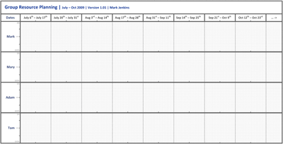
Using some of the basic concepts of the previously discussed swim lane diagram, each team member is assigned a lane, referred to as a “resource lane.” Added to the header, along the x axis, are annotated blocks to represent periods of time. Two week blocks are appropriate to my situation, although individual adjustments can easily be made. Using a typical paper size, landscape oriented, the two week blocks line up nicely with financial quarters (three months of the year). Here, as with the swim lane, a version and author are very important. To ensure that the same version is being used by all, I update my resource chart at least a couple of times a week.
Now I add the resource lanes for each group member. Each of the resource lanes are used to demonstrate an individual’s allocation to a particular project or effort, which is shown as a percentage along the Y axis
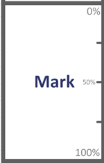
and measured in time along the X axis.
In the following example, I will demonstrate using four team members with their corresponding resource lanes.
All the components of the diagram used so far can be added to a Visio stencil, which allow future charts to be created quickly. In a moment, we will fill in the detail, but first let us build the legend to define it.
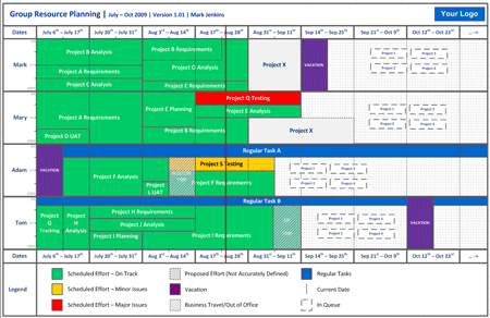
The legend is divided into three main columns. Within each column are three possible measures, represented by boxes in various shades and patterns, referred to as resource bars.
The first column resource bars (colored green, amber, and red) demonstrate if an effort is on track. When a project is completed, the resource bars should all be green.
The second column resource bars demonstrate proposed/future scheduling that is yet to have an accurate time line, allowing vacation, business travel, and out of office time to be booked out.
The third column resource bars identify regular tasks, the current date, and items that are in queue but not yet defined.
These resource bars, annotated using the appropriate color and style will be added to the resource lanes, at the appropriate dates (x-axis) and percentages (y-axis), to show how long an effort will be sustained.
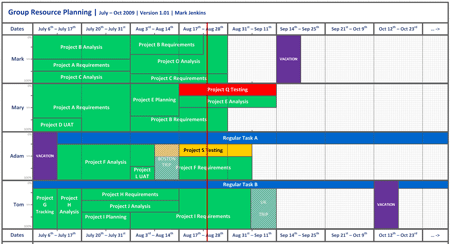
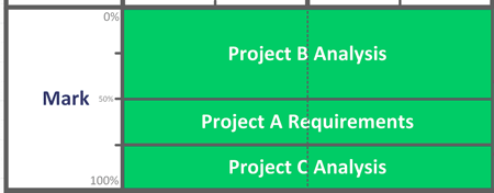
Starting with Mark, in July he worked on three projects simultaneously (maybe after reading the Bad-Ass BA series…!). Project A took up 25% of his time, Project B 50% and Project C another 25%, for the whole of July. As a result, Mark’s resource lane, with three resource bars, would look something like this.
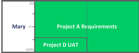
It is more likely though that resourcing realities will produce situations where projects are completed at different times, potentially freeing up more resource availability. For Mary, this was what happened during July. She worked on two projects, one project for two weeks at 30% and then her remaining time in July was taken up on another project. Her resource lane looked like this.
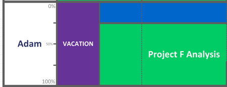
Adam has a regular task that takes up 25% of his time, such as allocation to support tasks, project roll-outs etc. This resource bar is stretched along the entirety of the resource lane, using the appropriate color as per the legend. He also took a week of vacation at the start of July, after which he worked on a project which, at the time, had some minor issues.
I’ll fast forward a little and fill out the rest of the resource lanes, to bring the diagram to the current date (Aug 25th)
We now have a clear picture of the teams resourcing. We can see that two of the projects in the group have some issues. We can see vacation schedules, business trips and can now easily demonstrate what the group is working on, down to the individual level.
One of the major strengths of this technique is that it is great for planning. You can easily identify when resources will come available. You can actually plan, at a basic level, as far out as you like. I use a different color and designation for planned effort that I have a rough or S.W.A.G. idea of how long it should take. These speculative resource bars are added to the resource lane.
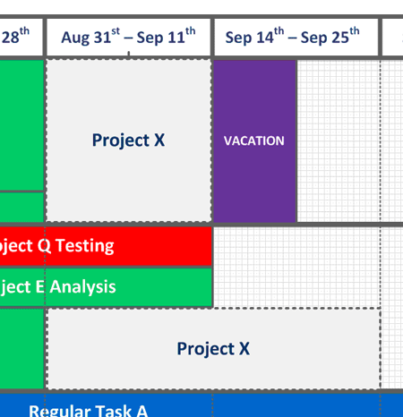
Adding further to planning possibilities, you can also begin to assign projects not yet defined, or in a future queue.

Finally, to further aid the reader, a line representing the current date is added which makes it simpler to see where current date is, in comparison to the data.
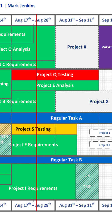
The diagram is now complete and so we have created a simple but highly readable chart to demonstrate how a team and/or individual is resourced, has been resourced and will be resourced. In adding the current date line (vertically, in red) the diagram posits a more real time view, which is perfect for a team web site and/or regular distribution fulfilling weekly or daily status reports.
As I mentioned at the start of the article, the four main goals for this diagram were achieved through this layered approach to the resource diagram. Over time, I have realized another major benefit from using this approach whereby employing this diagram prevents my team from being swamped by a deluge of new projects that are awarded high or immediate priority. In such a situation, the stock approach as a manager or executive is to immediately assign a team member to work on this new, high priority project; however, this new resource chart enables the manager to negotiate realistic work loads and time lines to sustain a balanced work flow. A manager is now deftly able to present how an effort should to be prioritized or scheduled by way of a visual aid that is universally understood.
Upon completion, the final illustration in this example looks like this.
Don’t forget to leave your comments below
Mark Jenkins is Manager Business Analysis Group at Websense. Mark has spent the last year establishing a formal Business Analysis Group at Websense that now plays an active role in all major business projects. As part of the development, he created new process and documentation standards, which assisted in the overhaul of IT Project processes, placing the BA Group at the forefront of the IT to business interactions. He can be reached at [email protected]
