Tag: Best Practices

Tips for Presenting Requirements and Deliverables

Business Analysts PresentingIn the past, my presentation of business level requirements has involved walking the business through the 80 pages of UML use cases and watching them glaze over after 10 minutes. I wanted them to understand what they were signing off on but this was not the right way to present the material to my audience. I was finishing up a project recently and was asked to present our teams’ findings, requirements specification and design to the director group.

My project was to develop a consolidated reporting tool that would bring together six different program data sets. So I took a user centered design approach to developing the business requirements and incorporated a lot of the information architecture tools and techniques I had learned on projects over the least three years.

I started with face-to-face consultations and workshopped the needs and wants of the service users who were required to supply reports. I also talked to internal users who would analyze and summarize the reports for the branch’s policy decision makers. We decided to use user stories and personas, want maps and process maps to present our findings about what the users really wanted and then used the site map and a prototype to show how the system would look and feel.

The presentation went extremely well as the directors were taken through the process and had the visual clues to show them what the user experience would be. So why was this presentation approach successful? I think it was because my BA documentation tends to be very visual, as I find that my audience likes to see how the design and the system will work, and need to be brought along the journey. In a recent presentation I told the story through the eyes of the users and found this was a very effective way to present my deliverables.

Here are my top five tips for presenting requirements and deliverables:

1. Establish and Communicate the Purpose. On my project, the service users clearly wanted a system that would help them manage and plan their day-to-day service business, not just a tool to use for reporting back to the funding branch. I presented our findings from the stakeholder consultations and then presented the six personas to demonstrate our understanding of these six key user groups. I told their story by presenting user scenarios and explained why they wanted what they wanted from the system. My key message was that the system users wanted a management tool, not a reporting tool. By clearly presenting this purpose and demonstrating through personas and user stories, the directors understood that this change would mean a win/win at implementation time as the burden of data entry for services would be lessened if there was something in it for them – namely useful management reports.

2. Use Visual Artifacts to Display Requirements and Design. The personas were a very powerful tool to show what the archetypal users of the system wanted and how the groups differed in what they required. We displayed the primary, secondary and tertiary user needs in a want map and this helped to show the key differences and commonalities of wants across the varied stakeholders. The process maps showed how the different groups would interact with the system and how we would help them through the process, streamline the process and reduce duplication of information. The prototype helped to show how automation and integration of data would decrease data entry burden and also capture information that could be used to aid their management and planning.

By presenting deliverables as user scenarios and showing the findings through use of personas and want maps, the directors were able to see the value in responding to the needs of the services as this would, in the long run, gain acceptance and quick wins for the system implementation. Walking this audience through use case after use case would have missed the mark with this group, as it would have been too detailed and technical and would not have given them the same feel for the concept of what the users wanted.

3. Understand your Audience. My presentation was aimed at the business users, and I needed to understand their needs so I could tailor my presentation to meet their needs. I needed to understand who the key players were? Who were the influencers and decision makers? What did they want from this system? What were the relationships between the different stakeholders? This was difficult as it was a short project (only 10 weeks) and I had little direct contact with some of the key players. Therefore, I worked closely with my business product owner to ensure he saw the deliverables in progress and had a chance to comment prior to their being presented to the directors and executives. I sought his guidance on how to handle the meeting; the dynamics of the stakeholders involved, and walked him through the key messages. This preparation meant that I could frame the deliverables in a way that would hit the mark for this audience.

4. Understand the Business Context. Presenting to an audience when you don’t understand their business does not end well for the presenter. In conveying understanding of requirements for the business and users, I believe it is important to know the business context. I did my research and preparation before the meeting and asked myself:

  • What are the key drivers for this change?
  • What processes are involved?
  • What are the internal or external environmental constraints or opportunities out there for this group?

Once you know the context, demonstrate that you understand the business needs and vision. Then demonstrate how your solution will meet that need.

5. No Surprises. In the past I have been reluctant to show my work in progress, as I wanted it near completion before sharing it (as the “Virgo” perfectionist in me wanted to make sure it was right!). In working on Agile projects in recent times, I have embraced this skinny solution concept and am now comfortable starting with a skinny version, and fleshing it out as the work progresses. When I had finished a piece of thinking about users, processes or design, I would share these artifacts with the core project team, the key business product owner and then refine. This iterative approach helped my target audience to get a feel for what the deliverable would look like and meant that, when it was being presented, it was not a new concept, just a more refined and validated version of what they had seen earlier. Remember that you are presenting your requirements design solution, not telling a joke, so sending material out beforehand as pre reading will not “spoil the punch line”. If you feel people may miss the point of your deliverable without you there to narrate, then allow for their questions at the end rather than taking questions throughout the presentation.

Don’t forget to leave your comments below


Maria Horrigan is an experienced business manager, IT strategic planner and information and communications specialist. She has over 10 years senior management experience within the pharmaceutical industry, not-for-profit and Government. As a principal consultant, Maria is an experienced information architect, senior business analyst and IT strategic analyst and provides advice on developing system requirements with a focus on information architecture and user-centred design, to ensure appropriate IT systems are intuitive and usable. She is a senior practitioner and a well-known Australian speaker on communication, user-centred design, and business analysis. She has experience managing large federal government contracts and project management of large scale business system implementation, systems planning, and analysis and change management. She has a reputation for innovation, managing change, driving strategy implementation and successfully delivering programs. Maria is a Board member and Vice President of Women in Information and Communication (WIC).

Reinventing the Resource Chart

Click on small images to enlarge

As we continue to examine traditional tools reinvented to establish effective communication, let us look at the resource chart. I’ve seen varying approaches to resource charts such as using graphs, spreadsheets, and Gantt charts; and while each of these methods yields results, the approach detailed in this article will improve the amount of information communicated in a single resource chart rather than using multiple diagrams. In short, this article concentrates on a technique that portrays layered meaning in a single chart.

As with the swim lane diagram, discussed in two August issues of Business Analyst Times, (http://www.batimes.com/articles/106-articles/453-reinventing-the-swim-lane-diagram-part-1.html) the resource chart will be constructed using Visio, replete with stencils, which will accelerate chart design time. This technique for creating resource charts serves four main goals:

  1. to communicate what my team is currently working on, what we have completed, and which projects are scheduled to commence;
  2. to provide insight into time spent on each individual project;
  3. to give guidance about the status ofan individual project;
  4. to facilitate,through a single diagram,the percentage of available time for each team member.

If you have similar goals then you should find this technique quite useful. I should point out that my team generally works on simultaneous projects tracked over a maximum three month period. In addition, this technique isn’t a way to define an actual end date (I use MS project for that).

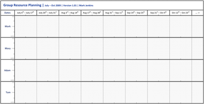
Using some of the basic concepts of the previously discussed swim lane diagram, each team member is assigned a lane, referred to as a “resource lane.” Added to the header, along the x axis, are annotated blocks to represent periods of time. Two week blocks are appropriate to my situation, although individual adjustments can easily be made. Using a typical paper size, landscape oriented, the two week blocks line up nicely with financial quarters (three months of the year). Here, as with the swim lane, a version and author are very important. To ensure that the same version is being used by all, I update my resource chart at least a couple of times a week.

reinventingtheresource1-sm

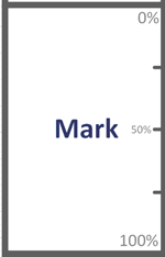
Now I add the resource lanes for each group member. Each of the resource lanes are used to demonstrate an individual’s allocation to a particular project or effort, which is shown as a percentage along the Y axis

reinventingtheresource2

and measured in time along the X axis.

reinventingtheresource3-sm

In the following example, I will demonstrate using four team members with their corresponding resource lanes.

reinventingtheresource4-sm

All the components of the diagram used so far can be added to a Visio stencil, which allow future charts to be created quickly. In a moment, we will fill in the detail, but first let us build the legend to define it.

reinventingtheresource5-sm

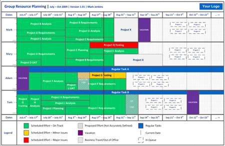
The legend is divided into three main columns. Within each column are three possible measures, represented by boxes in various shades and patterns, referred to as resource bars.

The first column resource bars (colored green, amber, and red) demonstrate if an effort is on track. When a project is completed, the resource bars should all be green.

The second column resource bars demonstrate proposed/future scheduling that is yet to have an accurate time line, allowing vacation, business travel, and out of office time to be booked out.

The third column resource bars identify regular tasks, the current date, and items that are in queue but not yet defined.

These resource bars, annotated using the appropriate color and style will be added to the resource lanes, at the appropriate dates (x-axis) and percentages (y-axis), to show how long an effort will be sustained.

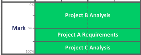
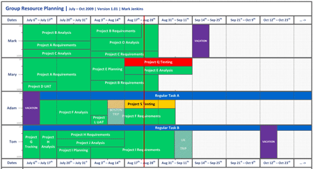
Starting with Mark, in July he worked on three projects simultaneously (maybe after reading the Bad-Ass BA series…!). Project A took up 25% of his time, Project B 50% and Project C another 25%, for the whole of July. As a result, Mark’s resource lane, with three resource bars, would look something like this.

reinventingtheresource6

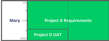
It is more likely though that resourcing realities will produce situations where projects are completed at different times, potentially freeing up more resource availability. For Mary, this was what happened during July. She worked on two projects, one project for two weeks at 30% and then her remaining time in July was taken up on another project. Her resource lane looked like this.

reinventingtheresource7

Adam has a regular task that takes up 25% of his time, such as allocation to support tasks, project roll-outs etc. This resource bar is stretched along the entirety of the resource lane, using the appropriate color as per the legend. He also took a week of vacation at the start of July, after which he worked on a project which, at the time, had some minor issues.

reinventingtheresource8

I’ll fast forward a little and fill out the rest of the resource lanes, to bring the diagram to the current date (Aug 25th)

reinventingtheresource10-sm

We now have a clear picture of the teams resourcing. We can see that two of the projects in the group have some issues. We can see vacation schedules, business trips and can now easily demonstrate what the group is working on, down to the individual level.

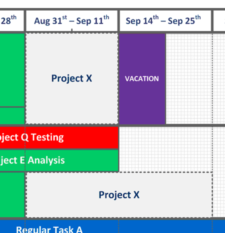
One of the major strengths of this technique is that it is great for planning. You can easily identify when resources will come available. You can actually plan, at a basic level, as far out as you like. I use a different color and designation for planned effort that I have a rough or S.W.A.G. idea of how long it should take. These speculative resource bars are added to the resource lane.

reinventingtheresource11

Adding further to planning possibilities, you can also begin to assign projects not yet defined, or in a future queue.

reinventingtheresource12

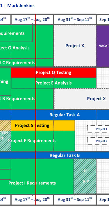
Finally, to further aid the reader, a line representing the current date is added which makes it simpler to see where current date is, in comparison to the data.

reinventingtheresource13

The diagram is now complete and so we have created a simple but highly readable chart to demonstrate how a team and/or individual is resourced, has been resourced and will be resourced. In adding the current date line (vertically, in red) the diagram posits a more real time view, which is perfect for a team web site and/or regular distribution fulfilling weekly or daily status reports.

As I mentioned at the start of the article, the four main goals for this diagram were achieved through this layered approach to the resource diagram. Over time, I have realized another major benefit from using this approach whereby employing this diagram prevents my team from being swamped by a deluge of new projects that are awarded high or immediate priority. In such a situation, the stock approach as a manager or executive is to immediately assign a team member to work on this new, high priority project; however, this new resource chart enables the manager to negotiate realistic work loads and time lines to sustain a balanced work flow. A manager is now deftly able to present how an effort should to be prioritized or scheduled by way of a visual aid that is universally understood.

Upon completion, the final illustration in this example looks like this.

reinventingtheresource14-sm

Don’t forget to leave your comments below


Mark Jenkins is Manager Business Analysis Group at Websense. Mark has spent the last year establishing a formal Business Analysis Group at Websense that now plays an active role in all major business projects. As part of the development, he created new process and documentation standards, which assisted in the overhaul of IT Project processes, placing the BA Group at the forefront of the IT to business interactions. He can be reached at [email protected]

Quick Tips to Improve Your Fact Finding Techniques

In business, we are often asked to draw conclusions and make recommendations. We have to engage in fact finding to ensure that the pieces of information on which we base our conclusions and recommendations are facts, not just speculation, assumptions, or opinions; we have to check any information we obtain. Most of our fact finding will be about how things are done, but it is also important to understand the underlying reason – the why things are done in a certain way – especially during the initial questioning. Our aim is accuracy. We lose credibility if the facts we are using can be challenged by others. This also requires that all evidence be documented in archives for future reference.

There are a number of different methods of fact-finding, and we need to decide which is the most appropriate to achieve the objective. Circumstances may dictate we use a combination of the following methods:

  • Existing Records include business artifacts, such as organization charts, job descriptions, company reports and accounts, departmental/procedural records, and user manuals. These are appropriate to use when well-established processes are in place and documented.
  • Written Surveys and Questionnaires can be used to collect information about attitudes and “hard” data from a large group. The advantages of using this method are that they cover a large target population and are reasonably inexpensive. The drawbacks are the low return rate from participants, generally 20 – 50% from random samples, and the need for very careful construction in order to obtain valid information. Of great concern is that participants self-select, meaning that people with strong feelings, either good or bad, will be more likely to respond than people who are indifferent to the topic.
  • Telephone Surveys are a rapid method of surveying the targeted population. They are more expensive than written surveys, but achieve higher rates of return. These are difficult to use for sensitive or personal topics since respondents will be reluctant to reveal this information.
  • Direct Observation and Site Visits are very useful at the beginning of a project to get a better understanding of the operations and begin building trust and rapport with the participants. It’s always a good idea to go and see things for ourselves, although this may be expensive.
  • Interviewing and Discussion require good preparation and a certain amount of skill to be productive. These should be scripted, but allow the interviewer leeway to pursue tangential topics.
  • Workshops / Focus Groups are an excellent approach to use for brainstorming, envisioning new approaches to a problem, and getting up to speed quickly on new topics. Typically, an interactive workshop contains between 5 and 20 participants and is conducted by an experienced moderator. Focus groups tend to be smaller in size, averaging between 6 and 12 participants. The main differences between the two group-types are workshops tend to be used for internal staff who will break into sub-groups to tackle specific issues, while focus groups are used for customers or external shareholders.
  • Internet/Virtual Conferencing is used to gather “expert opinion” from around the world. This is typically rapid and makes efficient use of resources, but requires technological infrastructure.
  • Database Sources such as Dun & Bradstreet, Gartner Group or Standard & Poor’s can offer useful background information that can be reviewed before using one or more of the other fact finding methods.

During fact finding, it is important to pay attention to the non-verbal behavior of the respondent. The use of voice provides additional meaning to the words spoken. For example, a long pause before answering may mean the person is trying to conceal or soften their real attitude. A hesitant “Yes” may really mean “No”. And stock phrases may indicate the person disagrees with you but is unwilling or unable to argue the point.

Observing physical cues also provides information. Restless shifting and tense shoulders often indicate discomfort with a topic, while looking away may mean the answer is not the whole truth. We need to observe the way that words are spoken.

The key skill in interviewing is active listening, meaning we objectively weigh the evidence being presented and pay attention to the non-verbal behavior, as well as the verbal components of communication. We can really demonstrate active listening by reflecting back, paraphrasing and empathy:

  • Reflecting Back. Words or emotions may be reflected back. An example is: “So, if I’ve got it right you enjoy your work generally, but find working with telecom clients more exciting.”
  • Paraphrasing. Repeating what the interviewee has said, but use your own words rather than the exact words they used.
  • Empathy. Listen to the way things are said and, if there is an underlying emotion, we can comment. For example, “You sound a little disappointed with that”, or “You were really animated talking about telecom customers; you seemed quite excited by the opportunities with them.”

Fact finding requires planning and skill. Well done, it provides a solid basis for analysis, drawing insightful conclusions, and making sound and logical recommendations.

Don’t forget to post your comments below


Tom Grzesiak, PMP, is an instructor for Global Knowledge and is the president of Supple Wisdom LLC. Tom has over 20 years of project management and consulting experience with IBM, PricewaterhouseCoopers, and dozens of clients. He has trained thousand of project managers and consultants. Global Knowledge is a worldwide leader in IT and business training. More than 700 courses span foundational and specialized training and certifications. For more information, visit www.globalknowledge.com.

Copyright ©2009 Global Knowledge Training LLC All rights reserved.

Show Your Value: Get Paid on Commission

Kupe’s Korner

I recently re-read an article on CIO.com, Should IT Workers Unionize. The author put forward the notion of IT workers unionizing.  There were many comments left by readers for and against the model. The idea of BAs unionizing is a concept that I found fascinating, but one that I totally disagree with.

This article reminded me of a conversation I had with a good friend, David Walker, with Borland.  He asked me if I thought business analysts would do anything different if their salaries were truly based on performance, A.K.A. commission based.  This is the complete opposite of unionizing. At the time I did not give him an answer, but now I believe we would absolutely change the way we approach projects, determine what techniques to use, and how spend our time every day. Projects are still failing or challenged at a high percentage.  As analysts we play a critical role in the success of projects.  If we really want to improve project success, let’s get paid on the success of our projects.  Are you feeling the wave of change? 

Let’s take a look at the sales profession for a moment. They sell products or services for a company and most of their salary is based on how well they perform against sales goals.  They miss their goal, their commission is less; they meet their goal they get their full commission, if they exceed their goal they get their full commission plus some.  So as a BA we play a key role on teams to implement projects or change for a company.  If your project fails your commission is less, if it is challenged you get most of your commission, if it is a success you get your full commission.  Man…I am getting excited just thinking about it. 

Ok, even if we don’t go the point of changing our salary structure we need to change our mindset and work like we are being paid on commission.

Here are a few characteristics of successful sales professionals that we can apply to our profession.  A successful sales person:

  • Ensures their goals are clear. Once they are set they work towards their goal every day.
  • Does what is necessary. Nothing more, nothing less.
  • Finds resources that can help them reach their goals.
  • Builds relationships to build credibility which leads to trust.

Goals: Before you start running down a path to elicit, analyze, and communicate requirements, make sure you, the project team, and business stakeholders are all on the same page regarding the scope and objectives of the project.  As the project is underway you should always look at the goals to make sure you are still headed down the right path.

Do what is necessary:  As an analyst there are many techniques at our disposal.  Just read the 300 plus page IIBA BABOK and you’ll see how many techniques we can use. Every project is different, so you need to do the work that will add value to your project.  Nothing more, nothing less.  For more information on this topic check out this webcast.

Find resources:  If you recall my last blog post, I talked about being the go-to person.  I said you need to be a consumer of information. There are so many resources (people, training classes, articles, discussion boards, etc.) available to you, and you need to find them and use them to be successful.  Here is a quote that I continually reference. 

“No one lives long enough to learn everything they need to learn starting from scratch. To be successful, we absolutely, positively have to find people who have already paid the price to learn the things that we need to learn to achieve our goals.”
-Brian Tracy, Author

In today’s environment we can’t go it alone.  Find the information and people you need to help you.  There is no shame in asking for help.

Build relationships:  Projects are all about people.  We work on projects with people and projects are created for people.  People want to work and help those they trust.  Take the time to really get to know the people you work with. 

Let’s not wait until we are paid on commission to change the way we work.  If we change our mindset now our project success rate will start to improve.  Things will be so good we’ll ask to be paid on commission!

Follow me on Twitter, http://twitter.com/Kupe

Preventing Disasters; How to Use Data to Your Advantage

The late Lew Platt, former CEO at Hewlett-Packard once stated, “If only HP knew what HP knows, we would be three times more productive.” This is a typical situation in large organizations, where far too often, disasters arise from lack of awareness. Critical information is available in the organization, but goes undetected, is not communicated or is blatantly ignored.

Take the recent mortgage meltdown, for instance. The banking industry has a wealth of data on consumers, robust credit risk models, as well as lessons learned from the past. Their analytics told them which loans were too risky according to traditional models. Yet, they decided to relax their standards, ignore the data…and the rest is history. Or, take the recent PR debacle around Southwest Airlines’ plane inspections. The FAA had inspection logs that could have told them that the planes were passing with flying colors at unprecedented rates, yet no one suggested conducting a site visit to see if the airline was actually performing those inspections. And when low-level employees reported issues to their managers, that information was not passed on. Fortunately, in that case, a tragedy was avoided.

If there is a question we should be asking in the current economic and regulatory environment, it is “Why does accountability so often fail, and what role does analytics play in preventing these disasters?” Organizations need to understand why they fail to detect early warning signs, how to filter and monitor available data to create actionable information, and how correctly applying analytics can turn data into knowledge. That knowledge can then prevent disasters and increase competitive advantage.

Why Accountability Fails

The repeated disasters that occur due mainly to failures in accountability arise for the following reasons:

  • Large, complex organizations (or environments) make it difficult to know what is happening “on the ground” and detect significant changes in the environment.
  • Very often, players in the organization (managers, employees, others) receive incentives only for presenting a positive picture and anchor on how things have worked in the past.
  • Organizations measure and monitor only past-focused, outcome measures, which only indicate a disaster once it has already occurred.
  • Many organizations lack the skills necessary to manage data, much less apply analytical techniques to make sense of that data and keep an accurate view of the current operating reality.

The Impact of Anonymity

The lack of awareness that often brings disaster stems from the anonymity that characterizes today’s organizations. A hundred years ago, most business transactions were conducted face to face. Business owners walked the shop floor. Customers who bought eggs from the village shopkeeper knew not only the shopkeeper, but also the farmer who raised the chickens. Loans where made to people the banker knew personally and regulations were made and enforced by local officials.

The more complex an organization becomes, the less transparency there is, and the more difficult it becomes to make good decisions. Consumers and producers don’t know one another. Decision makers and implementers don’t have direct lines of communication. By the time information reaches a decision-maker at the top, it is usually highly filtered, and often inaccurate. The information and implications have been spun so as not to upset management or cast dispersion on employees, and therefore fail to present the reality of the situation.

These conditions not only impair the organization’s ability to understand what is currently going on, but also remove any ability to detect change in the environment. Outside information can effectively be closed out in extreme examples. The U.S. automakers in the 1970s, who looked out the executive suite window into their parking lot and saw only U.S.-made cars, determined that Japan was not a threat. Meanwhile, dealers in California had significant early signals in their sales numbers that Japan was indeed a threat to the U.S. auto industry.

Incentives for Bad Behavior

An even more insidious problem is that disasters often arise because organizations have actually encouraged behaviors that lead to them. The filtering of information cited above is actually a very mild form of this. Employees and managers are rewarded for highlighting what they’ve done well, so why would they ever identify something that is going wrong on their watch?

We tend to blame those who bring bad news, whether they deserve it or not. Consider any major whistle-blower of the past. The amount of scrutiny, negative media attention and damage to their career is enough to dissuade most people from taking a stance. And yet those same people brought to light, and often prevented, significant disasters in the making.

So many organizations reward those who bring in good short-term results, prove out the organization’s current business model and don’t ruffle too many feathers. In return, we get exotic financial instruments in an attempt to make quarterly revenue, low standards on food or workplace safety and fudging on project and financial status reports. The contrarian voices pointing out the impending disaster go unheard and unheeded, and changes come too late to matter.

Driving While Watching the Rear View Mirror

The vast majority of the data that organizations look at represent outcomes that are past-focused. The traditional financial statements show the outcomes of business activities (revenues, expenses, assets, liabilities, etc.) while nothing in those statements measures the underlying activity that produces those outcomes. Hence, nothing gives any indication of the current health of the organization.

Kaplan and Norton sought to remedy this with their Balanced Score Card approach. By focusing on the drivers of those outcomes, the organization should be able to monitor leading indicators to ensure the continued health of the enterprise. Relatively few organizations have fully adopted such an approach, and even those few have struggled to implement it fully. Too often, managers do not fully understand how to impact the metrics on the scorecard. And as time moves on, the scorecard can fail to keep up with changing realities, suggesting relationships between activity and outcome that no longer exist.

Numeracy?

“Numeracy” is the ability to reason with numbers. John Allen Paulos, Professor of Mathematics at Temple University, made this concept famous with his book Innumeracy, in which he bemoans how little skill our society has in dealing with mathematics, given how dependent upon it we have become. Organizations today struggle to maintain a workforce that has the skills to manage the data their operations generate. Once the data have been wrangled, the analytical reasoning skills required to make sense of that data are lacking.

Analytics provides powerful tools for dealing with massive quantities of data, and more importantly, for understanding how important relationships in our operating environment may be changing. But without a strongly numerate workforce, organizations cannot apply these techniques on their own and have a very limited ability to interpret the output of such techniques. A lack of good intuition and reasoning with numbers means that many warning signals go undetected.

What Drives Organizational Outcomes?

Organizations that want to prevent disasters and increase competitive advantage first need to define what constitutes critical information – in other words, what really matters to the organization. Prior assumptions have no place in that determination. Let’s say, for example, a company is proposing to increase its customer repeat rate by increasing satisfaction with its service. But does that relationship between customer repeat rate and satisfaction with the service really exist? And to what degree? Amazon.com, for example, does not simply assume that a person who buys a popular fiction book will want to see a list of other popular fiction books. Rather, it analyzes customer behavior. Thus, someone who is ordering Eat, Pray, Love might see an Italian cookbook, a Yoga DVD and a travel guide for Bali as recommendations because other people who bought that fiction book also bought those other items.

The steps to decide what matters are:

  1. Decide what the organization wants to accomplish.
  2. Identify the activities (customer behaviors and management techniques) that appear to produce that outcome.
  3. Test and retest those relationships, collecting data from operations to measure the link between activity and outcome.

Once an organization has identified what constitutes its key activities, how can it find the information it needs to monitor them?

Find the points in the value chain where the key actions have to occur to deliver the intended outcomes.

  1. Collect critical information at, or as close to, those points as possible. The closer an organization can get to the key points of value delivery, the more accurate the information it can collect.
  2. Continuously look for the most direct and unfiltered route to obtain the richest, most consistent information on each key point of the value chain.
  3. Keep testing each assumption by asking the question, “What surprising event could I see early enough to take corrective action?”

Stop Trying to Prove Yourself Right

Several traditional ways of doing business blind organizations to warning signs of potential disasters. First among these is looking for data that confirms that all is well. Although extremely counterintuitive, it is critical to look for evidence that things are not all right. Ask the question, “if something were going to cause failure, what would it be and how can it be measured?” If it can be measured, then it can be corrected early and failure can be avoided. Rather than indicating what has gone right in the past, these measures contain warnings of what could go wrong in the future.

To see the early warning signs, follow this process:

  1. Ask what assumptions are being made in the process of executing strategy to deliver value. For example, if the goal is to increase the efficiency of inspections, is there an assumption that inspectors will become more efficient while still adhering to the same high quality standards? Or, in a call center, is there an assumption that reps can decrease call handle time and still provide superior service?
  2. These assumptions are alert points where failure might occur. Don’t wait for the final outcome, but track, measure and monitor each assumption to make sure it is playing out successfully. This process is well known to project managers. They don’t just design Work Breakdown Structures and Critical Paths and then wait around for the end date to see if the project was successful. As soon as a task begins to exceed its scope, the impact is assessed all the way down the line.
  3. Keep testing each assumption by asking the question, “What surprising event could I see early enough to take corrective action?”

Organizations that do this well are not operating with a negative, doom-and-gloom perspective. Rather, they want their positive outcomes so badly that they look for data that might be telling them something is going wrong so they can correct it before it is too late. They are willing to “Fail Fast” and “Fail Forward,” keeping the failure small to ensure large successes.

People Power the Process

Creating knowledge from data to prevent disasters depends on both technology and human skill. Computers are powerful tools that can help collect, store, aggregate, summarize and process data, but the human brain is needed to analyze the data and turn it into actionable information. It’s this human factor where the biggest gap exists in most organizations. Finding people who can perform the required analysis is becoming increasingly difficult. A spreadsheet is just a pile of data until someone applies critical thinking, adding subjective experience and industry knowledge to derive insights into what the numbers really mean.

Organizations must invest in developing these skills in their workforce. Here’s how:

  1. Provide employees with the training, job assignment, education and mentoring opportunities needed to develop their analytical skills, industry expertise and decision-making acumen.
  2. Subject decision-making to evidence-based approaches, providing feedback to improve future decisions.
  3. Ensure employees have the tools they need to manage the volumes of data they are expected to digest and act upon.

Blame Is Not an Option

In his book The Fifth Discipline, Peter Senge said that a “learning organization” depends on a blame-free culture. In other words, when a problem arises, people need to refocus from laying blame or escaping blame and start fixing the problem.

In today’s data-rich world, preventing disasters large and small requires monitoring and filtering through the large volumes of information that stream into organizations every day to find early warning signs of imminent failure. Intellectually, just about everyone will agree that it makes sense to look for what could go wrong. Emotionally, however, it’s another matter. It is both counterintuitive and intimidating to ask managers to search out constantly how the organization is failing. Establishing a blame-free culture is the final frontier to create a new awareness and encourage people to test assumptions, make better use of analytics and communicate information without fear.


Charles Caldwell is Practice Lead, Analytics, with Management Concepts. Headquartered in Vienna, VA, and founded in 1973, Management Concepts is a global provider of training, consulting and publications in leadership and management development. For further information, visit www.managementconcepts.com or call 703 790-9595.