
Tag: Tools

Can You Picture It? Yes with a Swimlane Diagram!

There is the adage “a picture is worth a thousand words” and there is some truth to this.  A picture is not just for capturing great moments like the company holiday party or a selfie with a friend.  It also provides an effective way of showing a process to people.

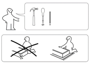
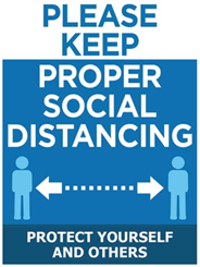
We see process pictures in our daily lives.  For instance, if anyone has ever brought home a piece of furniture from Ikea, you will recall they provide assembly instructions in the form of a picture, so you know how to put it together.  With the recent pandemic, you have likely noticed the signage that businesses put up on their doors, walls and floors to provide instructions to clients on how to social distance, wash your hands, wear a mask and how to queue for service.

PMTimes_May13_2022     PMTimes_May13_2022

As Business Analysts, we have strong and well-developed communication skills – both oral and written.  Our BA toolkits are filled with the many tools and techniques that we love and frequently use.  When it comes to reviewing a business process with a diverse audience, having it in the form of a picture is one of the best ways to visually explain it.  One of the techniques that does a fabulous job of this is the swimlane diagram.

I have been involved in many business transformation projects and the swimlane diagram is one of my most used techniques for capturing and analyzing business processes.  They provide an illustrated process summary and are easily understood by both business users and technical teams.

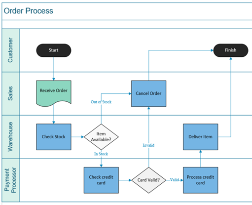
“A swimlane diagram is a type of flowchart that delineates who does what in a process.  Much like the lanes of a swimming pool, a swimlane diagram provides clarity and accountability by placing process steps within the horizontal or vertical “swimlanes” of a particular employee, work group or department.  It shows connections, communication and handoffs between these lanes and it can serve to highlight waste, redundancy and inefficiency in a process.”

“Swimlanes were first introduced back in the 1940s in what was called a multi-column workflow chart.  Later in 1990, Geary Rummler and Alan Brache brought forward swimlanes diagrams in their published book Improving Performance.”  Since then, the swimlane concept has become a widely used process modelling technique.  Swimlanes can also be referred to as Rummler-Brache diagrams or cross-functional flowcharts.

The BABOK highlights the swimlane diagram as a business process modelling technique used in flowcharts, Business Process Modelling and Notation (BPMN) and Unified Modelling Language (UML) activity modeling methodologies.  There are other modelling techniques that use the swimlane concept as well such as a Service Blueprint, Customer Journey map and LOVEM (Line of Visibility Enterprise modelling) methodology.

At one time, Microsoft Visio and iGrafx were the primary applications used to design these types of diagrams.   However, today there are a variety of cloud-based service options that provide the same functionality either for no cost or for a subscription fee.

The great thing about a swimlane diagram is that it doesn’t need to be overly complicated.  At a bare minimum, all you need to capture a simple process is:

  • The actors involved (eg. Roles, groups, departments, people)
  • The basic steps / activities (using an action)
  • The decision points (typically in the form of a question)

Advertisement

Once you have that, map out the sequential steps as they happen through the appropriate swimlanes from the start to end.  There you have it – a visual representation of a business process.  You can elaborate on this simple diagram to add in further details / identifiers (ie. phases, dates, timelines, rules, systems, notes, etc) as well as follow specific process modelling methodology notation.

PMTimes_May13_2022

Some of the benefits to using a swimlane diagram to capture business processes are:

Summary on a Page

  • Provides a visual picture that tells the story of a business process
  • Highlights the various stakeholders / roles, decisions and the hand offs between them
  • Allows for comparison of different states (eg. current vs future)

Easy to understand

  • Describes the steps in a concise and sequential manner
  • Provides clarity on the activities and who’s responsible
  • Both business and technical teams are able to grasp it

Facilitates process improvement

  • Highlights where delays / bottlenecks occur, areas of rework, mistakes or wasted time
  • Identifies any missing stakeholders or steps
  • Provides as a baseline for improvement

While the swimlane diagram has its advantages, there are a couple of pitfalls to be aware of.  A swimlane diagram can become quite complex and hard to manage if it isn’t structured properly.  Also, some business problems may not be apparent in a high-level diagram and swimlane diagrams can become quickly outdated or hard to maintain if it isn’t kept up to date.

Overall, the swimlane diagram is one of the best tools to provide a snapshot of a business process.  This process picture provides a summary that facilitates an understanding for both business and technical teams of what roles/people, activities and handoffs are involved.  Swimlane diagrams are readily used by Business Analysts and non-Business Analysts alike for this reason.  If you are just starting out on your BA career journey, this is definitely a technique to add to your toolkit.


How can I make my work more visible as an Agile BA to my team and organization?

Photo by Lala Azizli on Unsplash

Something I often hear from other BAs working in multi-disciplinary Agile teams is that their work sometimes seems invisible. Or at least, less visible when compared to other professions. To put that in context, designers will likely be mocking up various designs that they develop and share iteratively. Devs regularly build and release new features. Content designers produce content to be published.

However, as BAs, especially in an Agile environment it can be difficult to see similar types of tangible output. Of course, you’ll have probably been involved in defining various backlog items and likely some modeling of the business or its processes, as well as facilitating numerous workshops to find out information. But these individually maybe aren’t as ‘visible’ or as tangible to many in the same way as when compared to some of the outputs from other professions.

Advertisement

This is where it can be useful to take a step back to think about our role. The primary responsibilities of Business Analysts aren’t to create designs, content, or code. Very briefly, we’re there to understand how things work, work out the gaps, break down complexity, align initiatives to wider org goals and help articulate a clear specification of what needs to be done. Ultimately this enables decisions to be made, challenges thinking, and helps solve problems. These collectively, enable value to be created, as well as being the basis for many other professions to create their stuff.

So, what can you do to make our work less invisible and more visible? Luckily quite a lot, here are some suggestions on how we can shine the spotlight more on what we do;

  1. Shout about your successes in retros — for example, talk about how your work enabled a particularly important decision to be made or how modeling a specific part of the business has identified something no one in the team was aware of before. Maybe add the impact of not finding this out.
  2. Show and tells, town halls, basically anywhere you’re showing the work you’ve done as a team in an open forum — if you’re currently in a Discovery or Alpha phase it could be sharing what you have discovered and what that has enabled, or if you’re in Beta, it could be mentioned that through undertaking something like root cause analysis has helped to find a solution to a specific problem.
  3. Introduce a BA Service Framework —that helps to articulate the value of business analysis as a set of services in the context of your organization. If you’re not familiar with the BA Service Framework, I’d strongly recommend checking out the BCS publication ‘Delivering Business Analysis: The BA Service Handbook’ by Debra Paul and Christina Lovelock. (I’ll be sharing more on this topic through my LinkedInprofile over the coming weeks).
  4. Work in the open (where possible)— if you’re in the office, this could be just placing analysis outputs on walls in your huddle spaces, or if you’re using collaboration tools such as Miro or Lucid — then make sure they’re open for all those in your team to see. Encourage comments and conversation about them, and don’t worry about them being perfect.
  5. Talk about tasks with a clear mention of why you’re doing it— whether you’re using post-its on a Kanban board, putting tickets on Trello, or just talking it through in a stand-up. Be clear on the task you’re doing and the purpose behind it. For example, ‘understanding X piece of legislation so that we design and deliver a compliant service’, is significantly clearer than just saying ‘doing research’.
  6. Write blogs and articles — if you can and time allows, get in the habit of sharing successes of how business analysis has helped to reach a consensus or challenged thinking on a particularly complex topic. Maybe it’s solved an important problem for your users. Whatever it is, look to use the appropriate medium to tell your story. This may mean publishing an article on an internal space such as an Intranet, or if the subject allows, publishing an external blog.

Thanks for reading, let me know your thoughts by getting in touch on LinkedIn. It would be great to hear if you use any of the approaches above and how you find them, whether you’ve been using them for a while or if it’s something new you’ve tried after reading this article. Similarly, please share if you have found another effective way to make your work ‘more visible’, that isn’t listed above.

The Philosophical Data Analyst (Part 2): The Problem of Induction

Most organizations understand data is an asset, providing a rich resource that can be analyzed to unearth predictive insights. Many organizations invest heavily in their data operations to ensure the ongoing completeness, integrity, and accuracy of collected data. However, regardless of how complete, correct, and/or unbiased collected data may be, there are limits as to what insights can be gleaned from a given dataset. Acting on analytical insights outside these limits introduces risk.

This article describes the problem of induction – assuming you know more than you do – in the context of predictive analytics. It describes how the problem can be exacerbated by seemingly improbable or unlikely events. Finally, it outlines how PESTLE can be used to explore the limitations of the analysis, allowing Business Data Analysts to assess and mitigate risks.

Advertisement

The Problem of Induction

The Problem of Induction is not new. It has been explored by philosophers since at least the 18th century (Henderson, 2018).  Simplistically, the problem is the illusion of understanding – when people think they know what is going on when the situation is more complicated (or random) than they realize (Taleb, pg. 8).

In his book The Black Swan, Nassim Nicholas Taleb uses the plight of a Thanksgiving turkey to illustrate the problem (Taleb, pgs. 40,41). Assume a given turkey is fed every morning for 1000 days. On the first day, being fed is probably a welcome surprise to the turkey. After a few days, the turkey will start to notice a pattern and become more confident that it will be fed the following day. Over the course of the 1000 days, the turkey’s level of confidence will grow to the point that they expect – indeed are quite certain – that they will be fed the following day.

However, on day 1000, the turkey is not fed and is instead slaughtered – an event that would seem completely unpredictable (a black swan) to the turkey given its experience over the prior 1000 days. Of course, if the turkey had known about the tradition of thanksgiving, it may have been able to factor this into its predictions. Alas, this information was outside the realms of the turkey’s knowledge and experience.

Black swans are used by Taleb to describe events that seem improbable and/or unfathomable. Before the “discovery” of Australia, the idea that a swan could be anything other than white seemed preposterous to Europeans. However, a single sighting of a black swan by European settlers was enough to invalidate the understanding of an entire continent (although for the local Whadjuk Noogar people*, the idea of a swan being anything but black would have been equally preposterous – perhaps making the coming of European settlers their white swan event?)

The year 2020 provided us with an example of a black swan that no doubt exacerbated the problem of induction for many organizations. Most organizations failed to foresee the rise of COVID and its impact simply because it was outside their lived experience – a black swan. Neither its occurrence nor impact could be reliably inferred from the information they had – just as the turkey could not foresee its demise. As such, predictions for 2020 based on historical information were unlikely to be accurate. 

Note that this does not mean the pandemic and its impact could not be predicted to some degree. In the same way, the Whadjuk Noogar have always known swans could be black, health and virology experts have been publicly predicting and even planning for a pandemic for some time (see Rosling 2018, pgs. 237-238 and NHS England, 2013). In addition, available analysis from previous outbreaks of disease, such as SARS and Swine Flu, could have provided some insights into the impact of a pandemic (see Smith et. al. 2009, Australian Government Treasury 2007). However, until 2020, a pandemic was not part of the lived experience for the vast majority of organizations. Therefore, it was unlikely to be factored into their analysis and planning.

Containing the Problem of Induction: Know Your Limits

In the context of predictive data analytics, the problem of induction is often exacerbated by:

  • Assumed Continuity – when analysis implicitly assumes that the conditions under which data were collected and analyzed will be sustained. An organization may believe they are thinking about the future, but they are usually just extrapolating the present, and that’s not the same thing at all.” (Lovelock, 2020).
  • Information Blind Spot – this is where information is not considered in or has been omitted from the analysis.

Relying on predictive analytics without understanding its limitations can lead to a false level of confidence in predictions. This may mean organizations continue to ‘trust’ analysis beyond the point of reliability, taking longer to respond to changes in conditions. (It worked before; it should work now!)

Techniques such as PESTLE can provide an effective frame for exploring the limits of predictive analysis. By assessing the reliability of analysis under different scenarios, Business Data Analysts can understand and communicate limitations. The table below uses PESTLE to help identify some high-level scenarios to explore.

Political

Change in government; Market intervention (think quantitative easing); Legislative changes; Change in political stability (think Arab Spring); Act of terrorism (think 9/11); War;

Economic

Interest rate change; Cost-of-living changes; Global trade and/or supply chain issues; Recession or economic shock;

Social

Health care or housing availability crisis; Social movement (think Me Too, Black Lives Matters); Mass migration (think Syrian Civil War); Epidemic/Pandemic;

Technological

ICT security incident (think ransomware); Disruptive technology (think Uber, Air BnB); Scientific discovery/scrutiny (think smoking and cancer); Severe defect/breakdown (think Boeing 737 MAX);

Legal

New regulations/de-regulation; Employee malpractice; Legal scrutiny;

Environmental

Infrastructure outage; Natural disaster; Man-made disaster;

The technique can be used to identify more detailed scenarios that are applicable to a given organization. The idea is to think of a range of scenarios, from the probable to the seemingly improbable. Once identified, you can assess if analytical outputs are likely to be valid under each of the scenarios, thus identifying the ‘bounds’ within which the analysis can be applied. For example, you may deem that analytical outputs would continue to be reliable in the event of a democratic change of government, but not in the event of a military coup.

Once the limits of analysis are identified, steps can be taken to:

  • Identify additional information sources that may be used to strengthen analysis
  • Identify types of events that should trigger a review of analytical models, measures, and outputs
  • Identify and mitigate any risks posed by the scenario
  • Inform decision-makers of the limitations of the analysis so that it may be factored into decision-making.

Conclusion

Predictive analytics can provide useful insights to support decision-making. However, the conditions under which data is collected and analyzed naturally limit the situations under which insights should be applied. Understanding these limits can prevent analytical results from being relied on in circumstances outside of these bounds.

At the end, it’s better to have some understanding of what you don’t know than to think you know what you don’t.

*The author acknowledges the Whadjuk Noogar people, the traditional custodians of the Derbarl Yerrigan (or the Swan River), and pays her respects to elders’ past, present, and emerging.

References:

  1. Taleb, Nassim Nicholas, The Black Swan: The Impact of the Highly Improbable, Random House, 2007.
  2. Rosling H., Rosling O., Rosling Ronnlund A., Factfulness: Ten reasons we’re wrong about the world – and why things are better than you think, Flatiron Books, 2018.
  3. Henderson, Leah, The Problem of Induction, Stanford Encyclopedia of Philosophy, March 2028. (Last Accessed January 2022).
  4. Lovelock, Christina, The Power of Scenario Planning, BA Times, July 2020. (Last Accessed January 2022).
  5. Operating Framework for Managing the Response to Pandemic Influenza, NHS England, (Last Accessed January 2022).
  6. The economic impact of Severe Acute Respiratory Syndrome (SARS), The Australian Government Treasury, 2007. (Last Accessed January 2022).
  7. Smith, Keogh-Brown, Barnett, Tait,The economy-wide impact of pandemic influenza on the UK: a computable general equilibrium modelling experiment, The BMJ, 2009. (Last Accessed January 2022).

Who is in, and Who is Out

Imagine attending a meeting, and all the participants but you, are contributing ideas to a discussion. You are clueless. Maybe you missed a conversation, or you did not read an email? There could be numerous reasons why you could not contribute during the meeting. One instance could be that you were not included in an email chain or not invited to a meeting.

Leaving recipients off unintentionally (or intentionally) from any form of communication can lead to confusion and misunderstanding between the team members. A little bit of proactive questioning can help avoid hits and misses. Ask these questions first:

  1. Who should and should not be on a meeting invitation?
  2. Who should and should not be on an email chain?

The obvious answer is: It depends

Next, ask these additional questions to finalize the list of recipients. Evaluate the responses before hitting the send button:

  1. What is the email or meeting topic?
  2. Would skipping a team member in an email or meeting lead to miscommunication?
  3. Will including all the team members make a few of them feel that the meeting was irrelevant to them?

Advertisement

You can answer the above questions by leveraging these options:

  • RACI (Responsible, Accountable, Consulted, and Informed) matrix: RACI matrix can be a great source of stakeholder information for global projects.

For example: List the Responsible parties under the To list or Required Attendees. List the Informed parties under the Cc list or Optional Attendees.

  • Working Agreement: No RACI matrix? An Agile team working agreement can come to the rescue. Define who are the core team members. Refer to this list when sending out any email communications or meeting invites.

Tip: Core team can be cross-functional with stakeholders across the organization.

  • Email distribution list: Say the team size is small (4 to 6 members) and there is no RACI matrix or working agreement, then create a distribution list that includes the email IDs of all the team members. It is less effort and error-proof when selecting a list instead of individual email IDs for sending any form of communication.
  • Instant messaging group chats: Most instant messaging tools allow the setup of groups. Create one for your team and post a message in the team chat. Plus, there are options for the recipients to acknowledge the chat message (emojis such as like, happy, celebrate, and such).

In conclusion, despite the ideas mentioned above, there are chances that someone is still left off an email chain or a meeting. Be a team player, reach out, and get them caught up. The crucial element is that the entire team is on the same page.

“We need to be on the same page and not play the blame game” – Nate Heying.

Turn your specifications into living, digital documentation

Digital transformation requires the use of new tools and new ways of working – also for business analysts. We often facilitate this for other groups of people, and we should be ready to look at our own habits and preconceived notions as well and embrace new mindsets and tools. This article offers a take on what ways of working could look like for the digital business analyst.

Collaboration is becoming increasingly digital, and this also gives business analysts many opportunities to work smarter and better. That is, if you are ready to let go of documents and spreadsheet, and instead embrace digital tools for wikis, notes and backlog management. With a wiki tool, you can easily build your requirements documentation using webpages in a tree structure. Your first pages describe your scope. Each of those pages can then be broken into details on several pages that branch out. If you are familiar with mind maps, you will see that this is basically the same structure. In fact, a mind map can be a great first sketch of how to structure the content of the wiki.

Advertisement

The wiki structure allows your documentation to grow dynamically without you losing the overview. This structure is very well suited for agile development. If you focus on establishing the scope first, you will soon have some documentation that is accurate, though it is high level. You can describe the scope of your initiative first, and sign that off with your stakeholders. Based on that, you can discuss deliverables with your developers, and establish your backlog with features or epics. The features or epics can then be prioritized with your stakeholders. You can then detail out the requirements on your wiki, and the team can break down the user stories based on the wiki. This means, that while your scope is fixed and signed off, your detailed requirements get fixed and signed off incrementally in the same pace as the team is developing. I have experienced this to be a good way to be able to handle scope creep (because I have the scope to keep the requirements in check) and to avoid analysis paralysis and requirements rot. Because it is digital, I can create links from my backlog items to the relevant parts of the specification.

The basic concept can be illustrated like this:

Why not just add my requirements to the backlog items, and avoid all the linking? Well, because I want my documentation to describe my product holistically, including its context. And I want my backlog to describe the increments that the product is built in. So I need both.  I can then communicate, what my product is and does without also having to communicate the increments it was built in, which is completely irrelevant to most of my stakeholders. I can easily share a wikipage with a link or present it in a meeting. This means fewer powerpoints to produce.

Once the product is built, I no longer need the backlog – my documentation is what describes the product. And with that documentation established at the very early stages of the product development phase, I can communicate what the product looks like through its whole life cycle, from the birth of the idea to the decommissioning of the product. Each page is automatically version controlled, which makes the change control much more granular, and changes easy to manage without keeping extensive change logs. In some digital tools, you can even set up approval workflows to make sure that the right people sign off on changes. I like to think of it as the DevOps mindset implemented in requirements analysis.

You can add any kind of content. A webpage has no limits when it comes to content – pictures, text, tables, links, and attachments. Your documentation can contain much more than a traditional requirements specification, such as personas, test data, samples of production data and other types of examples. Because of the tree structure, I always know which objective or process a detailed requirement supports. Obviously, various kinds of diagrams play an important role. Traditionally, you would argue that you must do your modelling using a modelling or BPMN tool. The reason for this is that your models can then be reused by others. In theory, this is true. However, I have never experienced this reuse in my 15 years as a business analyst.

Over the past couple of years, I have practiced using pen and paper for visualizations, and I have integrated this into my ways of working. It is a great way to work because it helps me focus and process information. It is also free of the constraints a computer program sets when you create digital visualizations. To my own surprise, this approach is very compatible with digital documentation. Simply take a photo or scan a drawing and add the image to the page. It can then be enriched with text for elaboration. This is particularly useful when describing scope, features or epics and application landscape. Digital and analogue are not contradictory, but complementary.

I have recently published two articles on BA Times related to using pen and paper, which provide some tips for getting started:

Start your visual facilitation journey with letters

The icon library: My favorite analogue tool